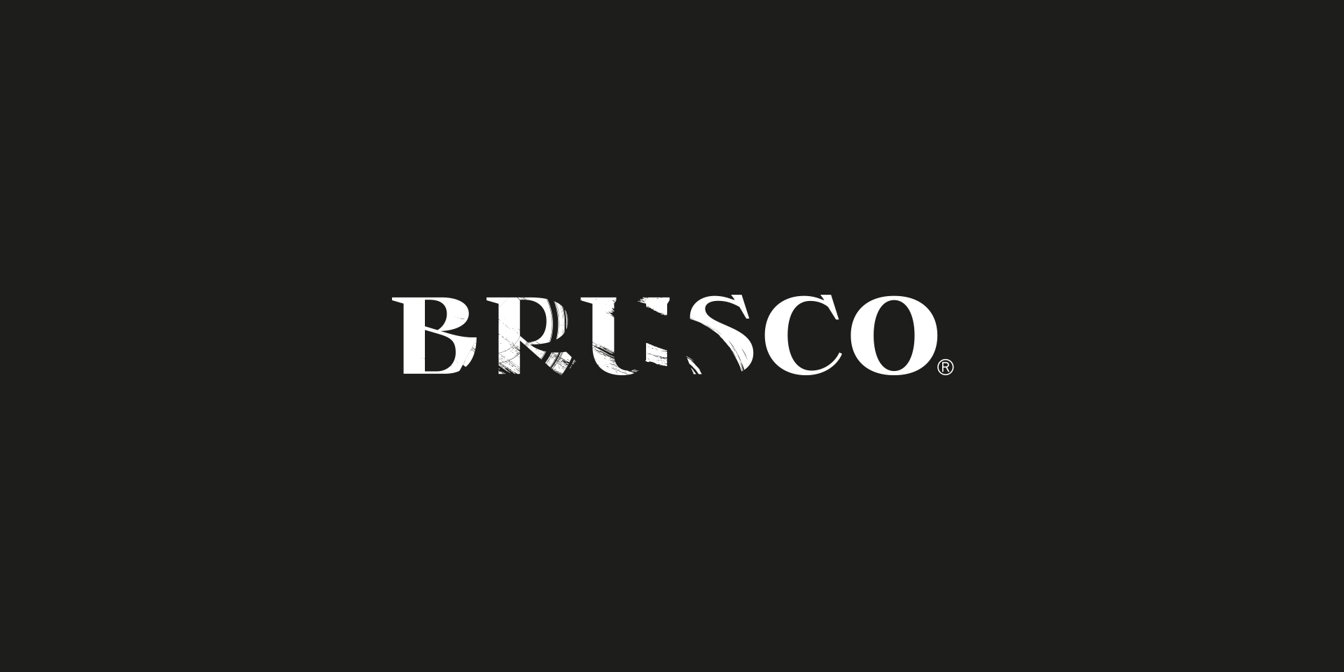
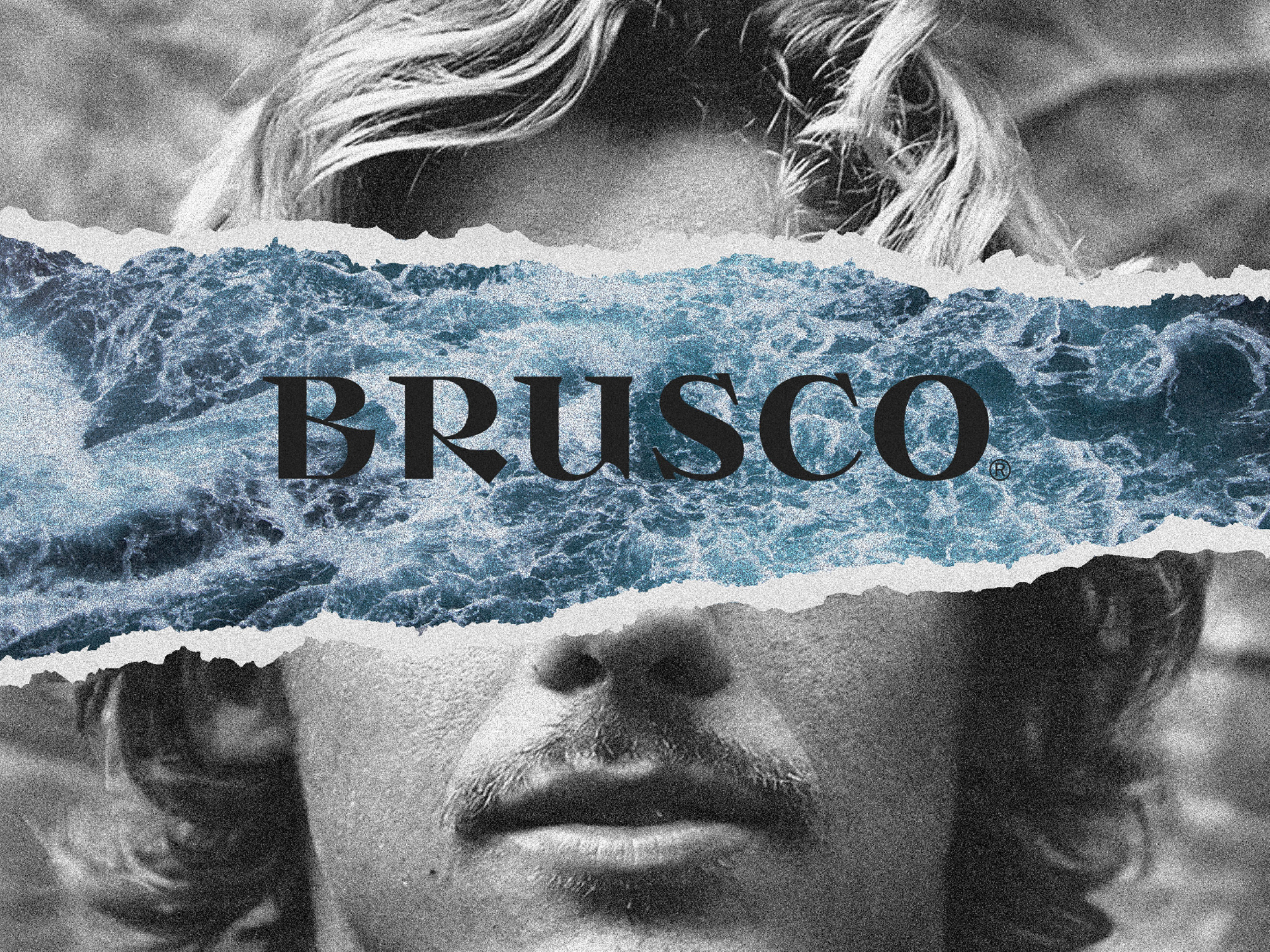

BRUSCO is a Portuguese expression signifying abrupt, rough, sudden.
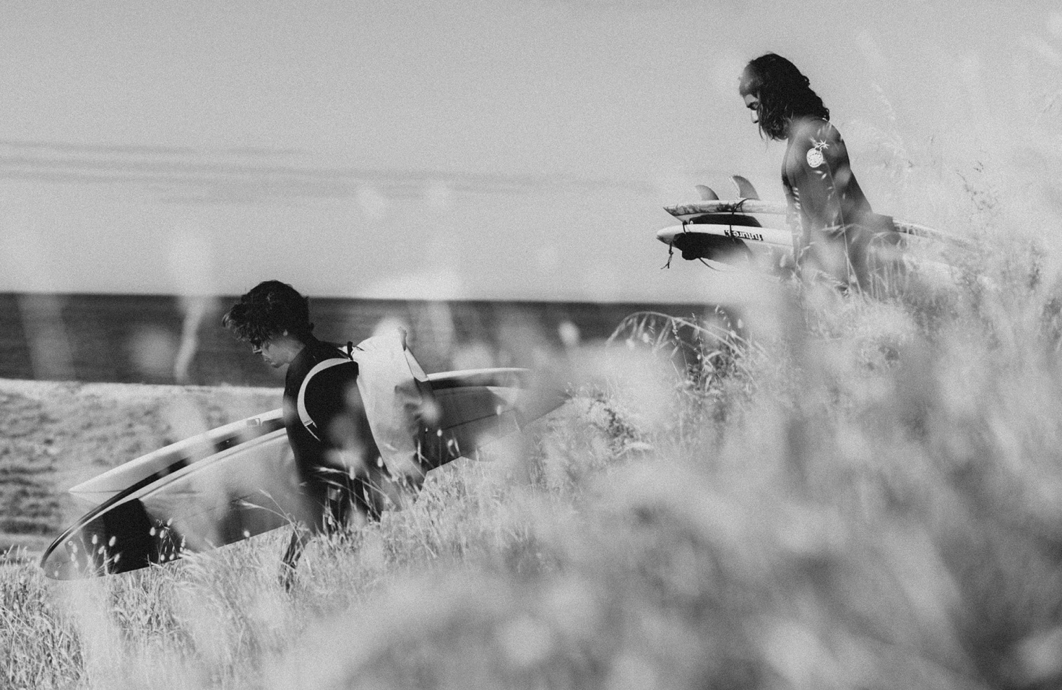
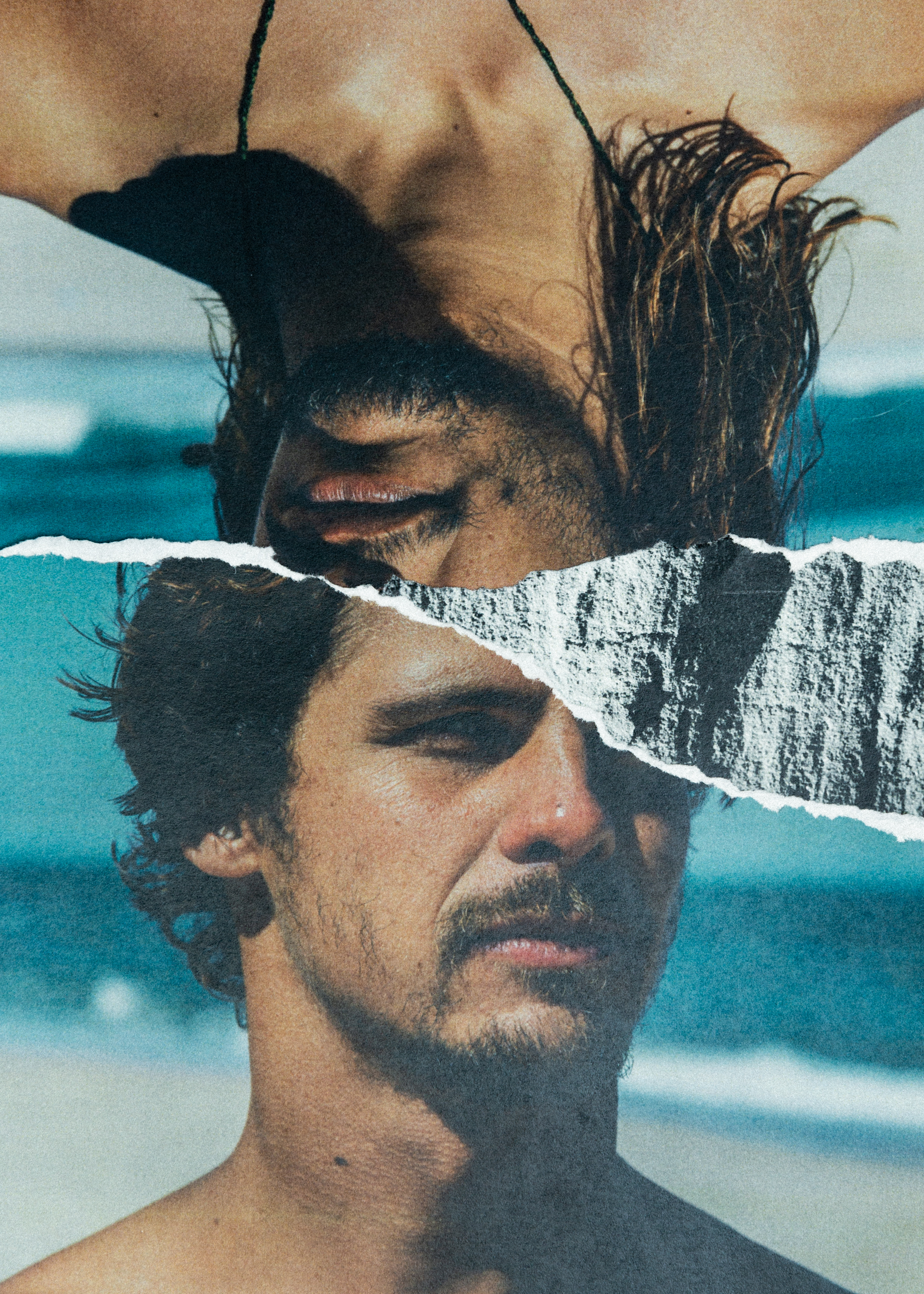
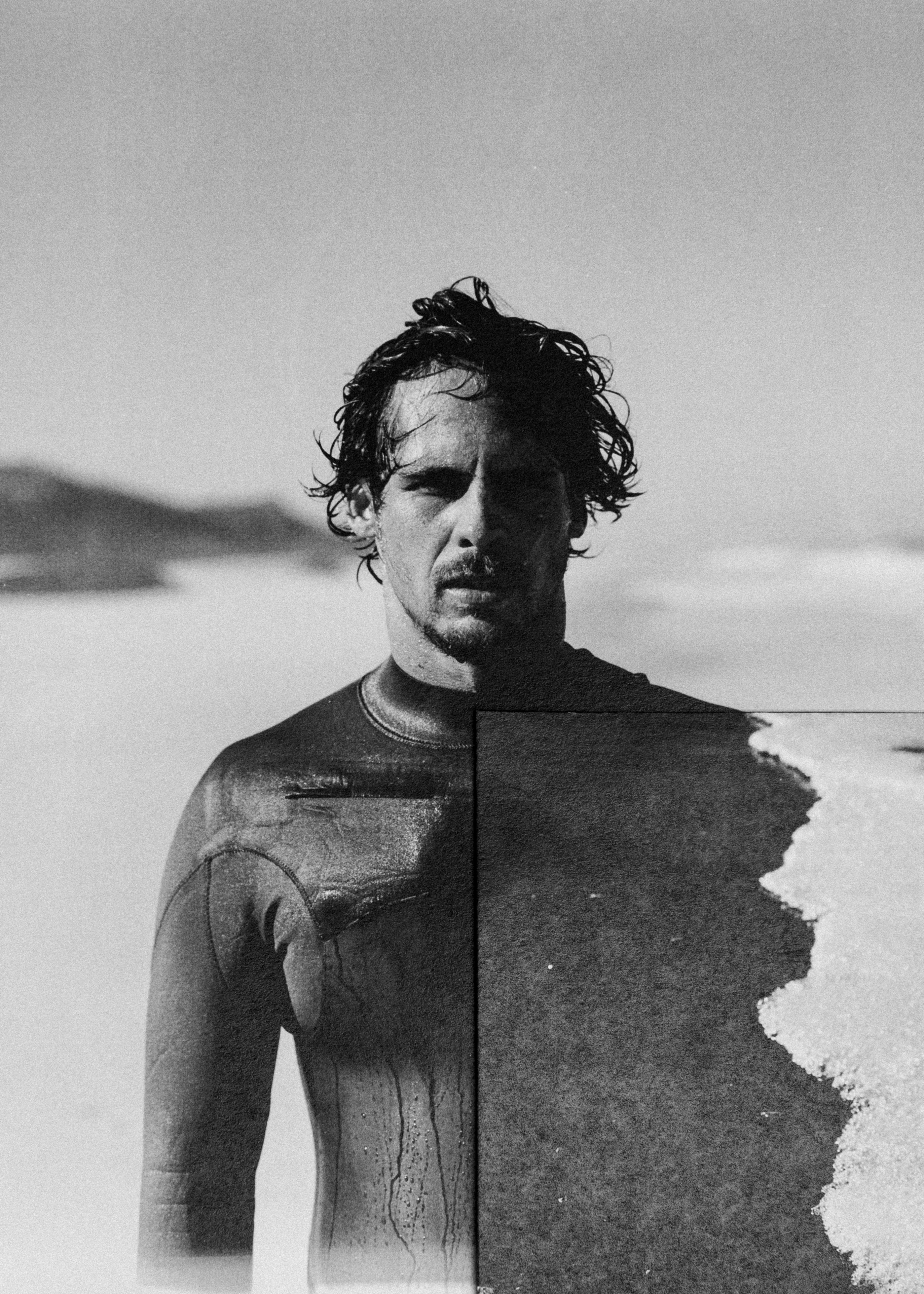
BRUSCO situates the brand in a raw, wild universe as a spontaneous, indomitable expression of force driving you to move forward without looking back. Surfing stands precisely in these ethereal moments of strength to embrace unrepeatable waves. To reinforce the impetuous strength of the ocean and BRUSCO, we have added brand signatures which contextualise the brand in its scope of action:
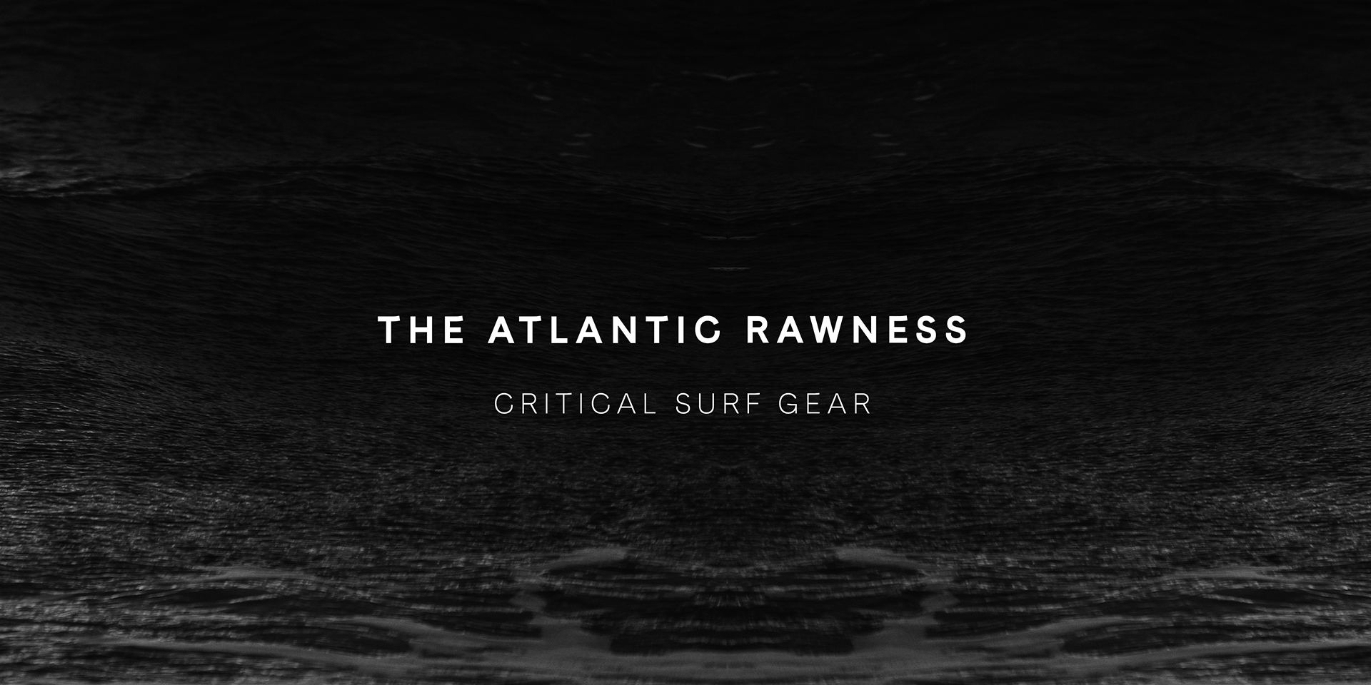
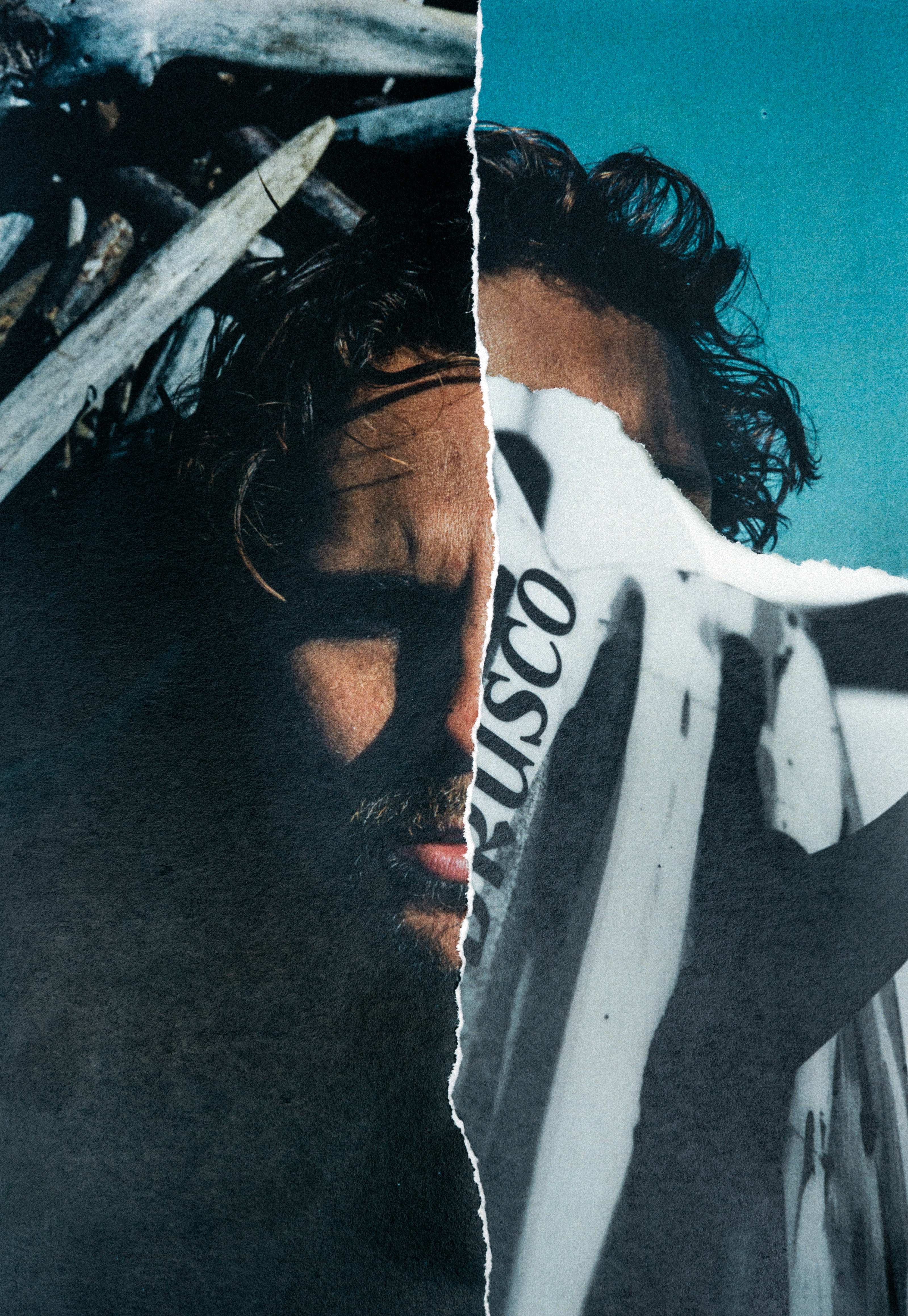
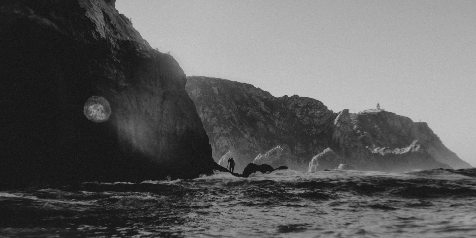
The Atlantic Rawness — With eyes on the Atlantic, BRUSCO stands on the coarse shores of the European territory, embracing abrasive the universe it holds.
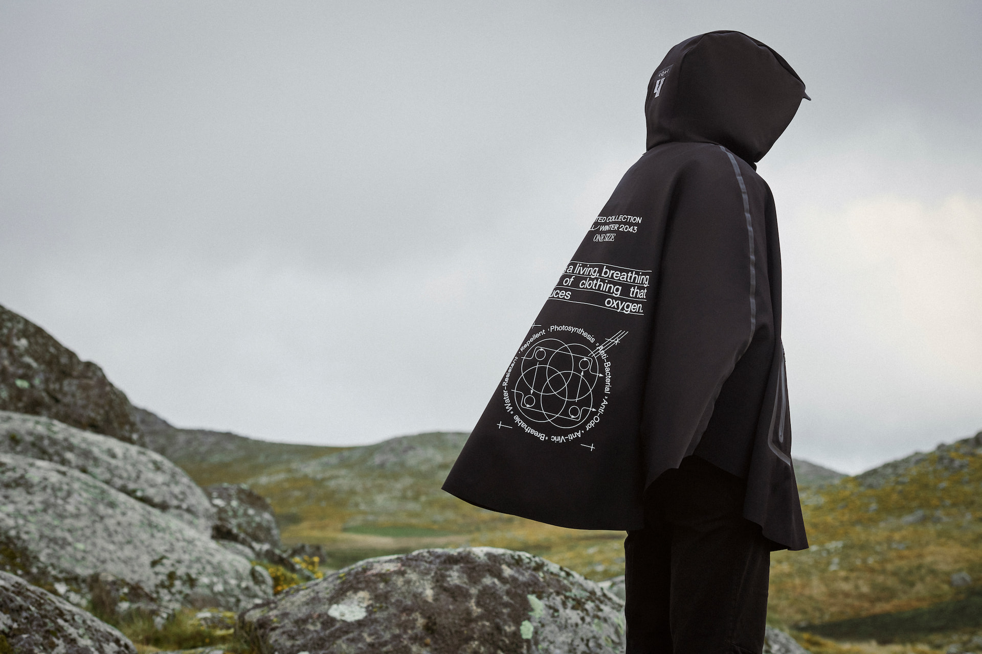
Critical Surf Gear — BRUSCO is made for extreme tricks when the surfer must be absolutely sure that the gear will hold as their absolute best ally.
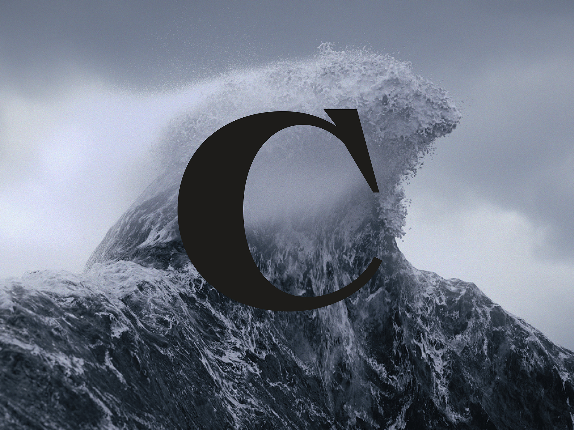

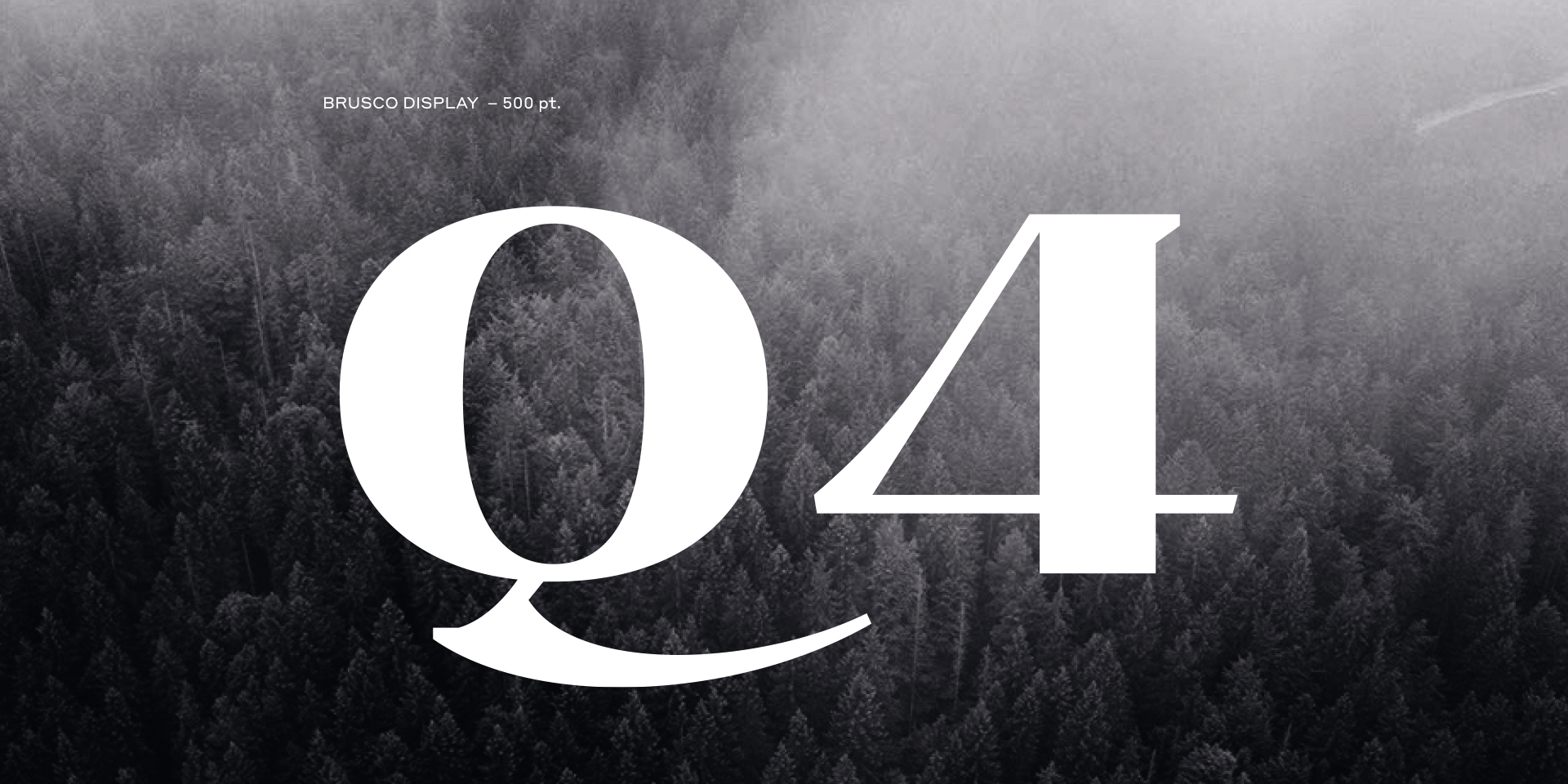
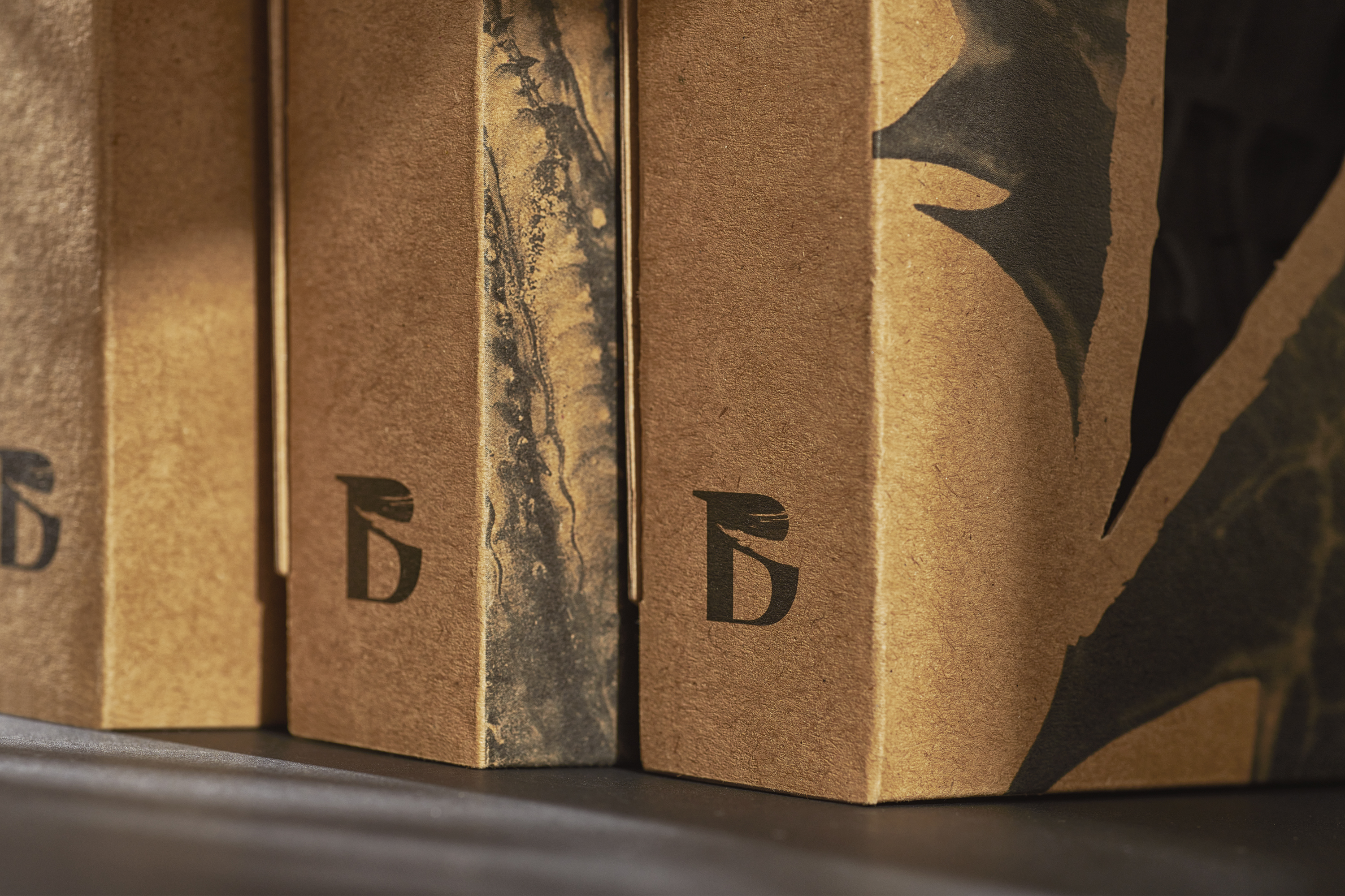
The original typeface BRUSCO, co-created together with Luís Bandovas, is born from the brand’s core values. It is strong, heavy and curvilinear. Twirls from the Atlantic shore and broad volumes of the ocean are represented in the contrasting shapes of letters reminiscing the sharp feeling of waves hitting and water whirling around.
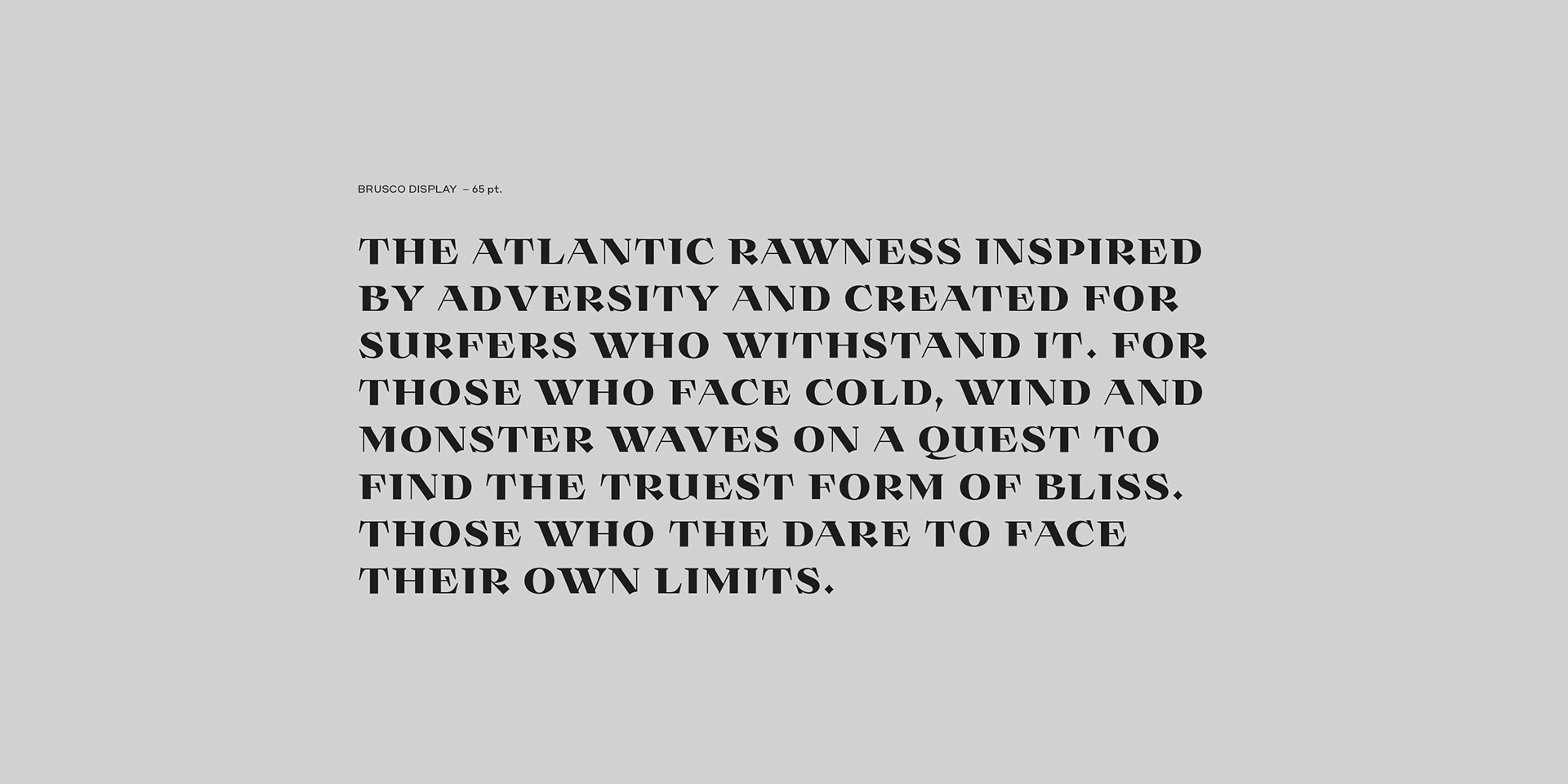
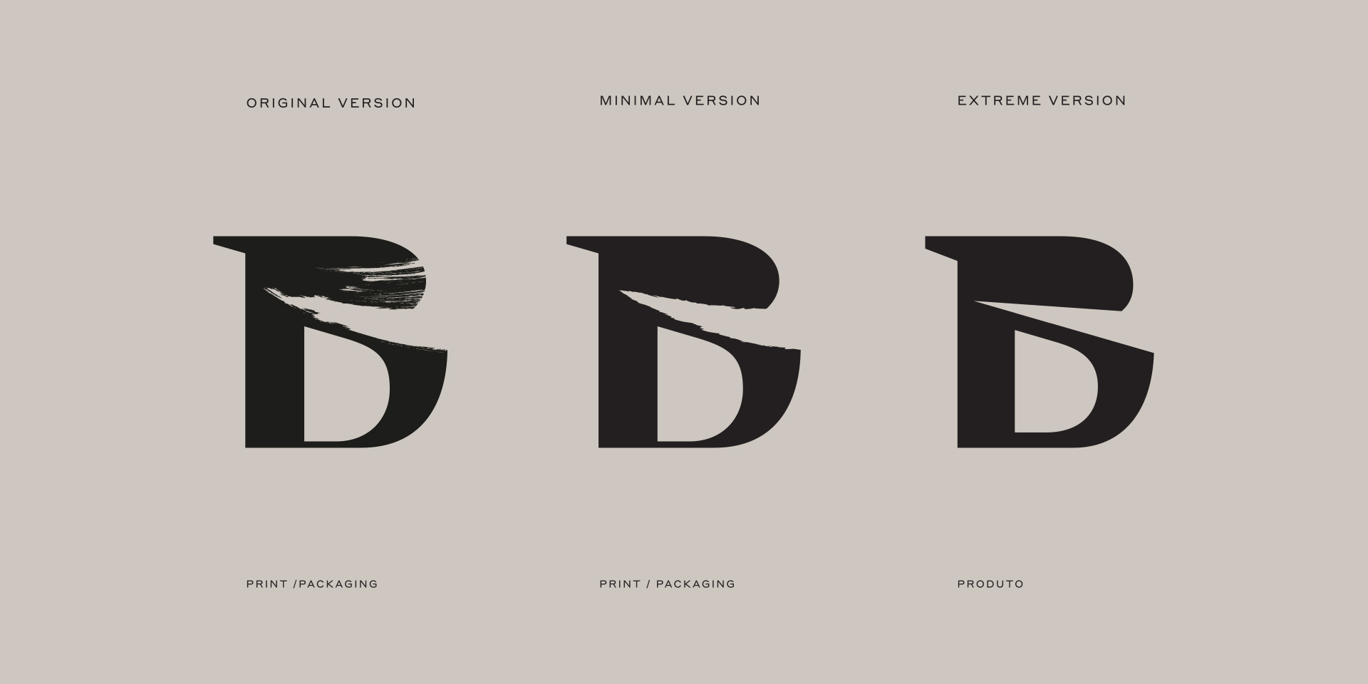
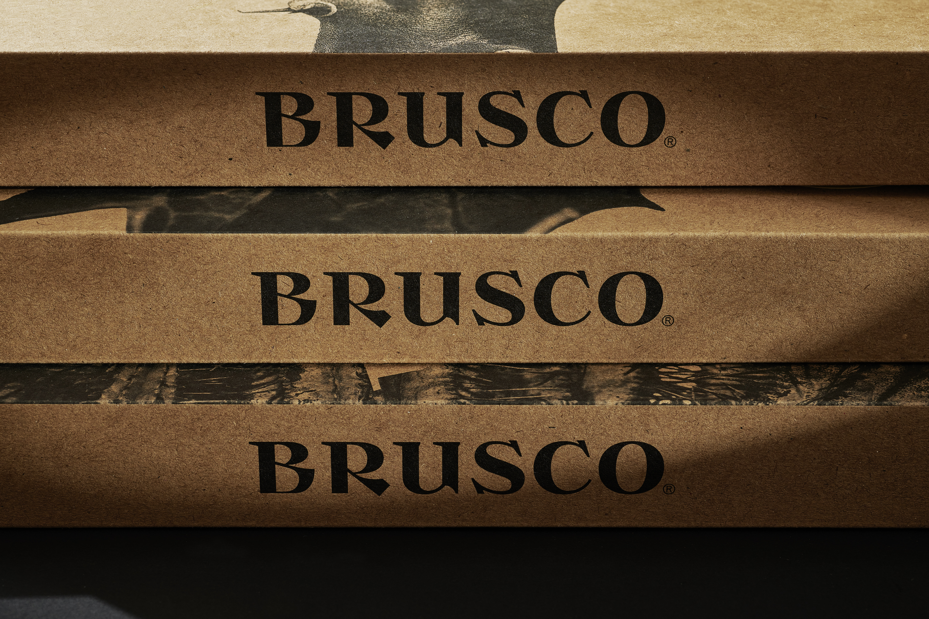
Much like surfing in the Atlantic, BRUSCO Display Type is harsh and severe. This is portrayed throughout the characters in jagged angles and straight/curvy cuts, namely in the “R”, “B” and “K.” The bulky serifs remind of harpoons and fishing hooks, resulting in a singular body type. The “B” in BRUSCO summarises the brand’s motto when applied as a monogram. This typeset, composed of 32 letters plus numbers and punctuation is applied to various brand expressions: packaging, products and other supports.

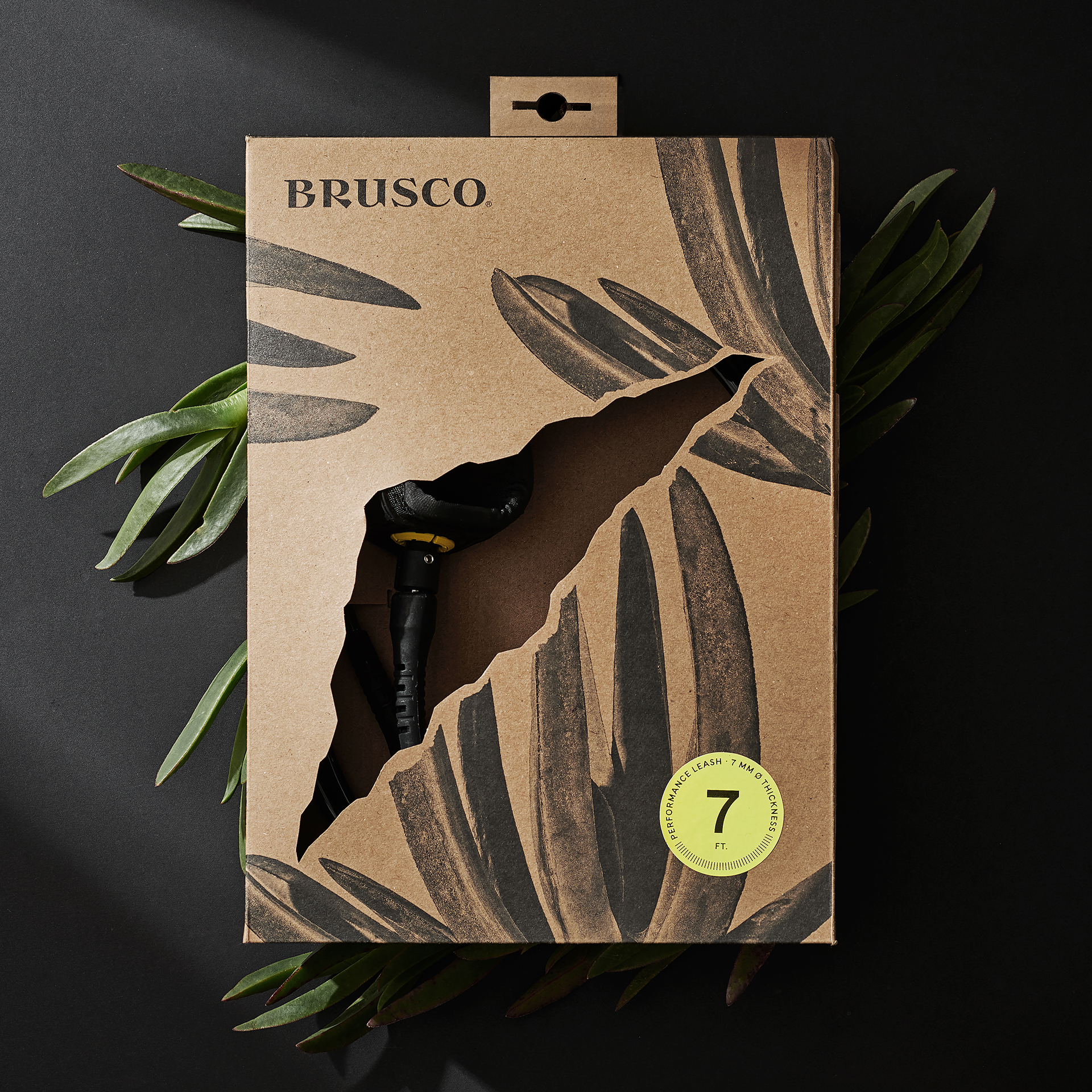
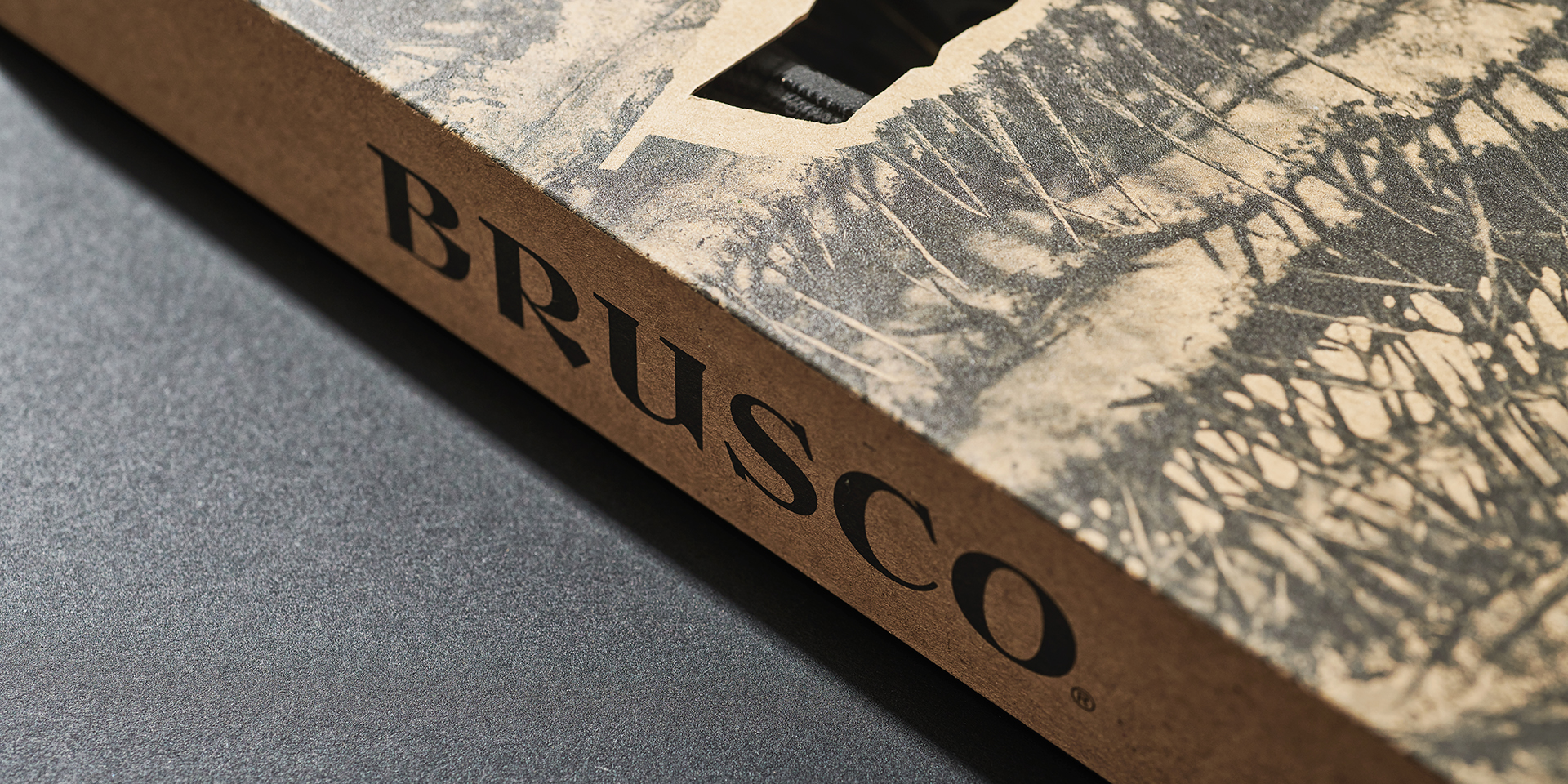
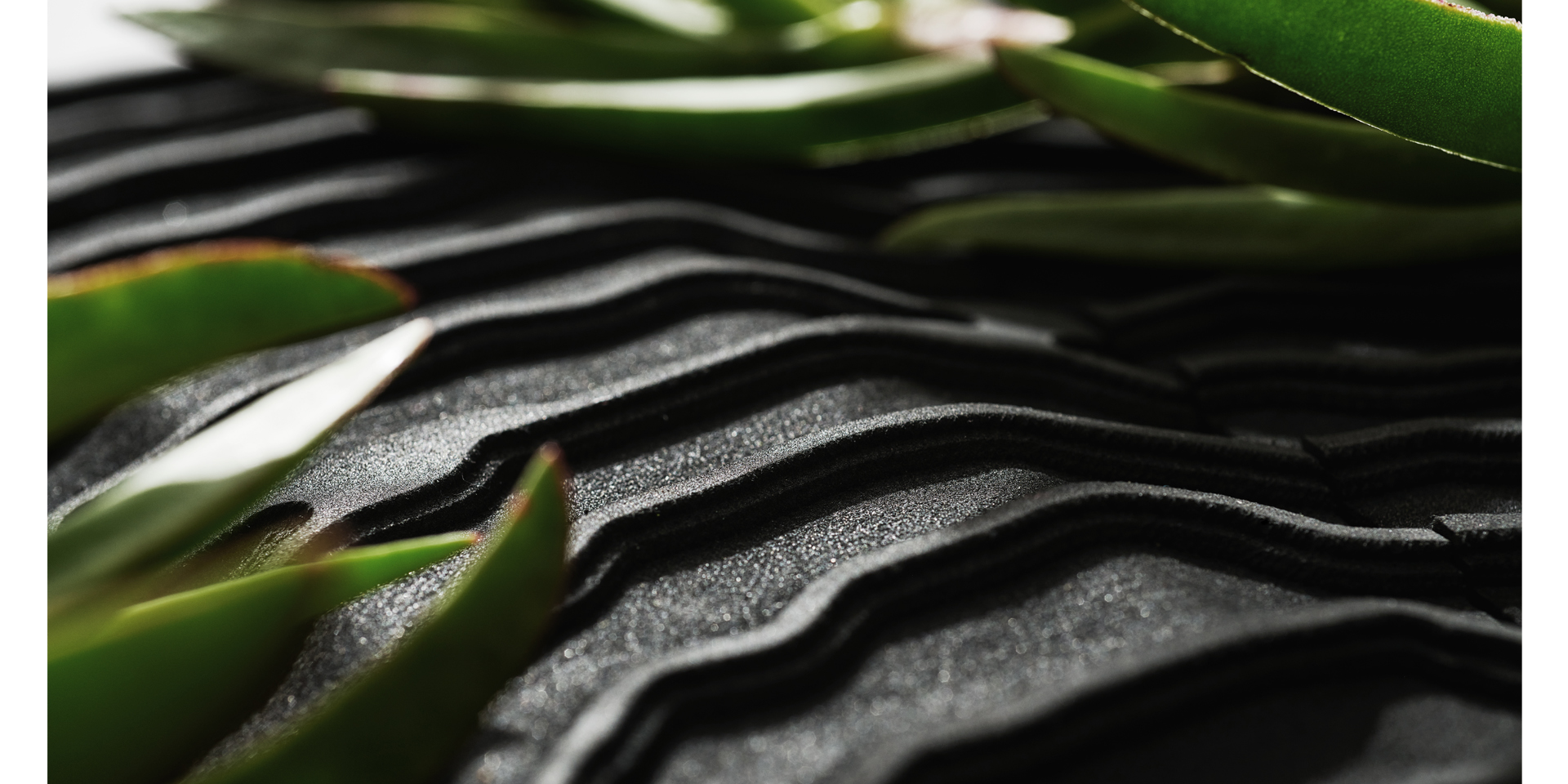
BRUSCO’s packaging has been inspired in the rough movement of opening a packing. The rip in the front of the package underlines the movement which gives name to the brand. To reinforce the Atlantic aspect present in the brand’s universe, we have collected several resilient plants that exist in the seafront of these territories.
BRUSCO stands for environmental responsibility and sustainability, bringing these values to the core of the brand’s DNA, along with an emotional yet performance-focused narrative. For this reason, the packages are eco-friendly, free of any plastic or toxic components, produced of micro-perforated 1mm cardboard, printed in water ink with personalized cutters. Each different product depicts a different plant: Maritime Thistles, Sea Fennel, Stone Cactus, Exposed Cactus, Fetus, and Ice plants.
All the additional information (such as size and number of pieces) is placed in a fluor-yellow sticker, which stands out strikingly from the packaging.
Huge thanks to:
Nic Von Rupp, Zé Diogo Areia and Francisco Belo
PRO Surfers: Nic Von Rupp & Miguel Blanco
Film “The BRUSCO, The Atlantic Rawness”: João Sousa / Le Joy
Film: “Introducing BRUSCO”: Binsurfen / Felix Gansicke
Typography: Satori Fonts / Luis Bandovas & This is Pacifica
Photography: João Sousa / Le Joy, Jack Johns, Al Mackinnon, Mendo Dornellas, Steve Ende, Tobias van Schneider
Product Photography: NUMO / Nuno Moreira