Primosfera
Branding, Featured, PrintType & click enter
Categories
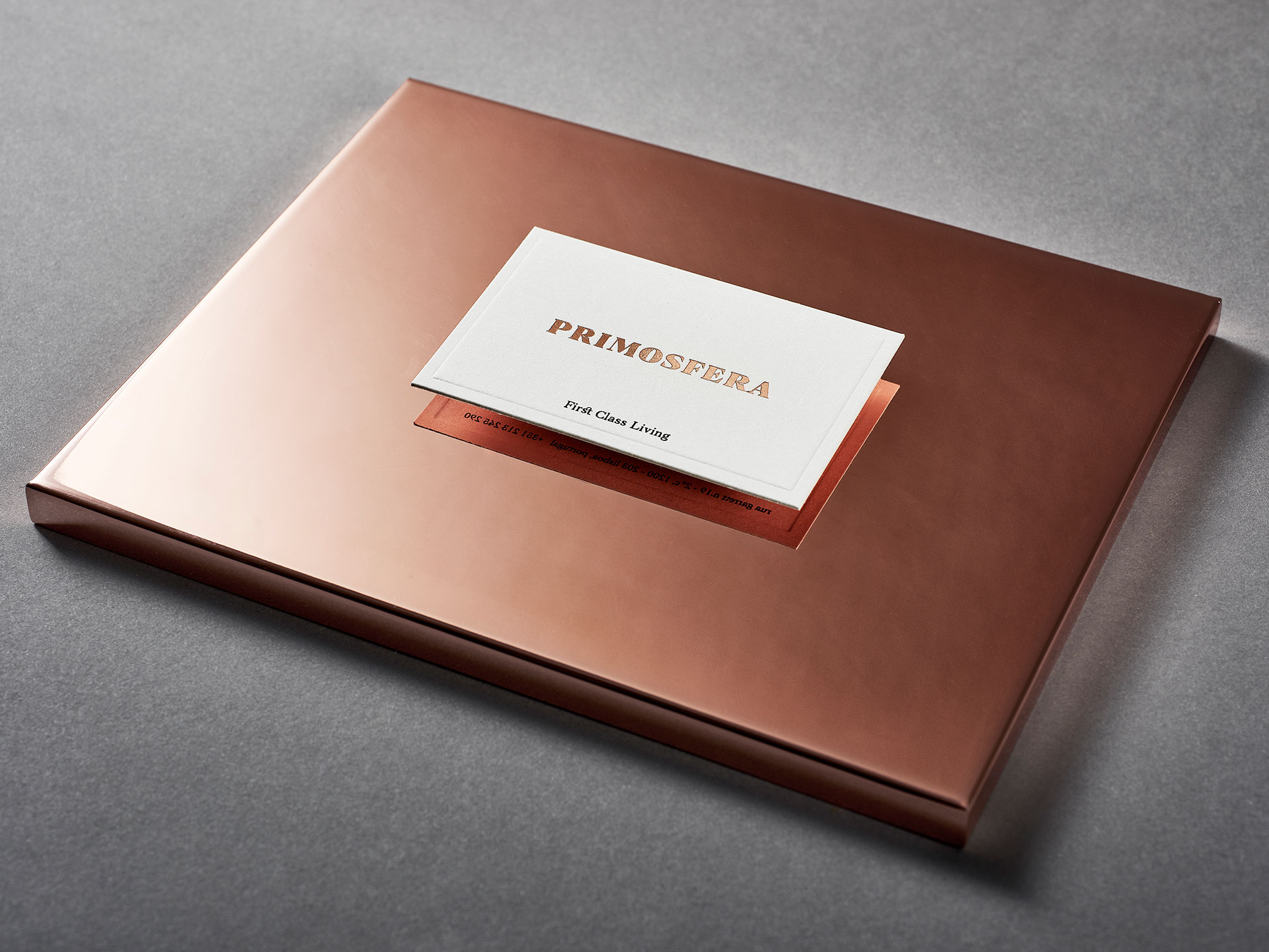
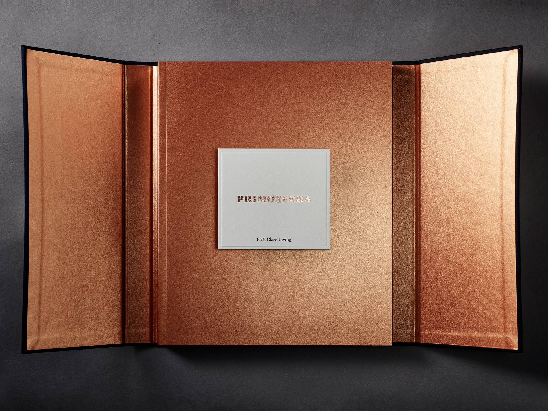
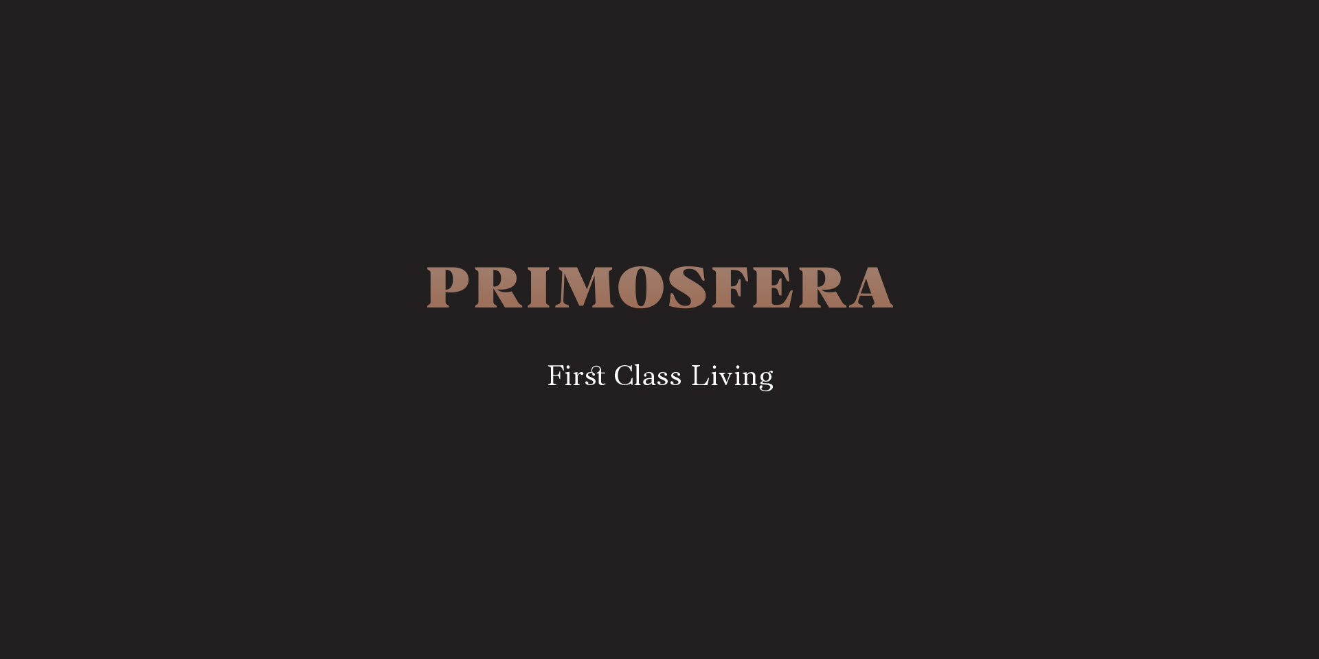
Primosfera
Rebranding of Primosfera, prioritising a perception of value and uniqueness.
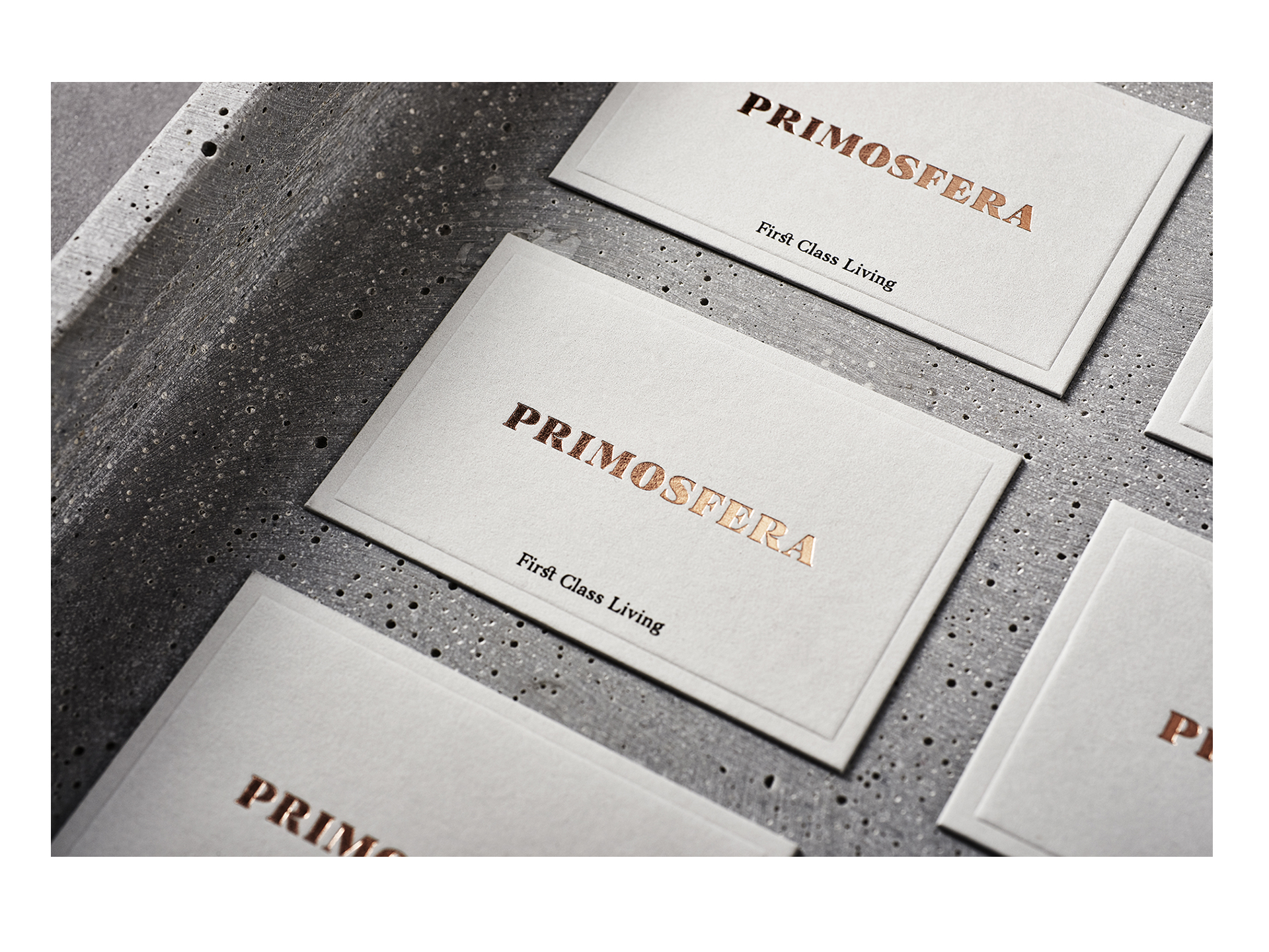
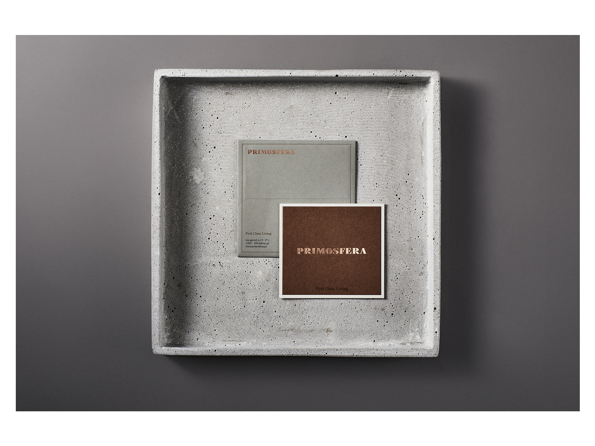
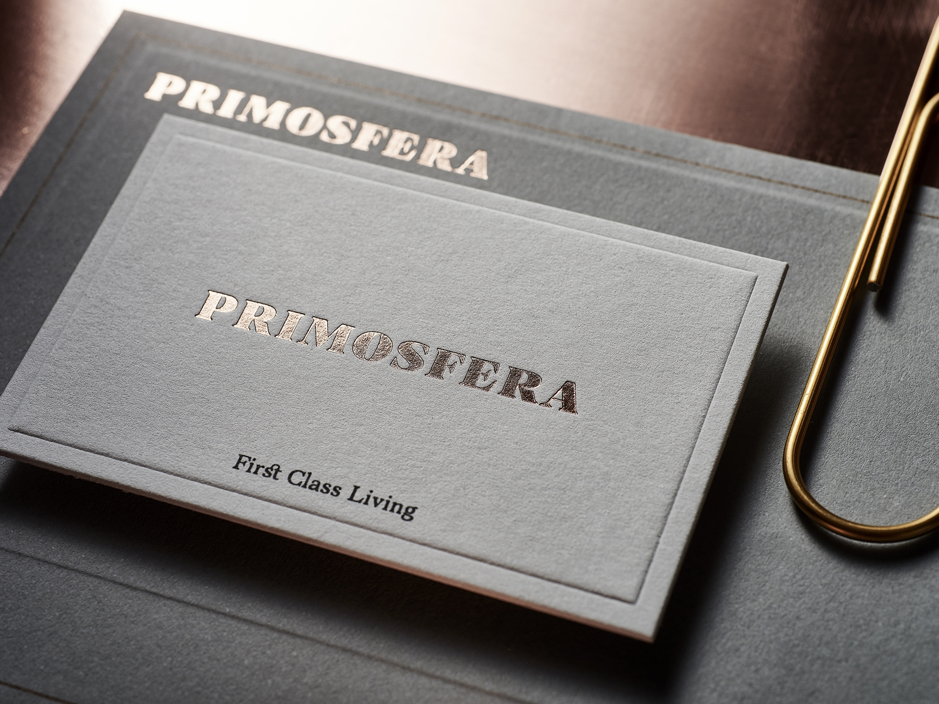
The selected typography allows a more charismatic and unusual drawing that alone inspires a private and exclusive universe.
Branding – 2018
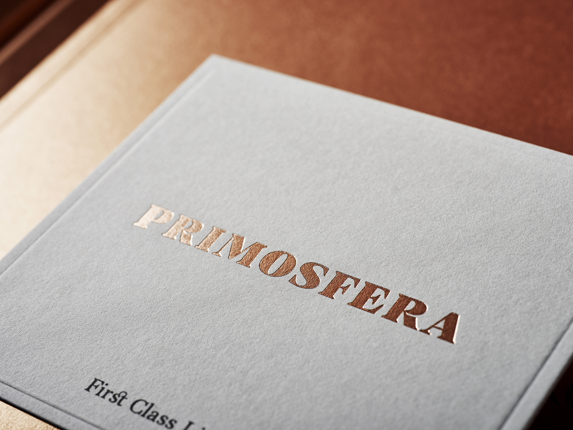
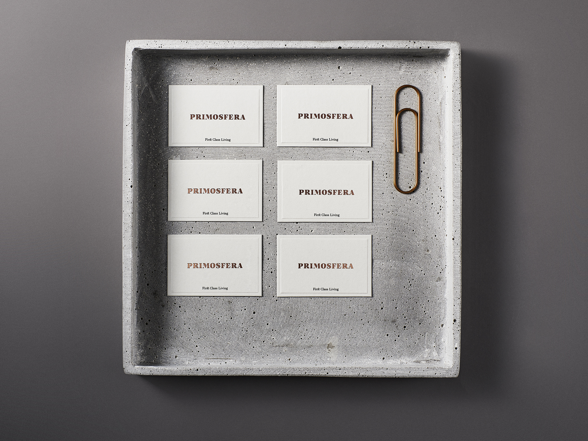
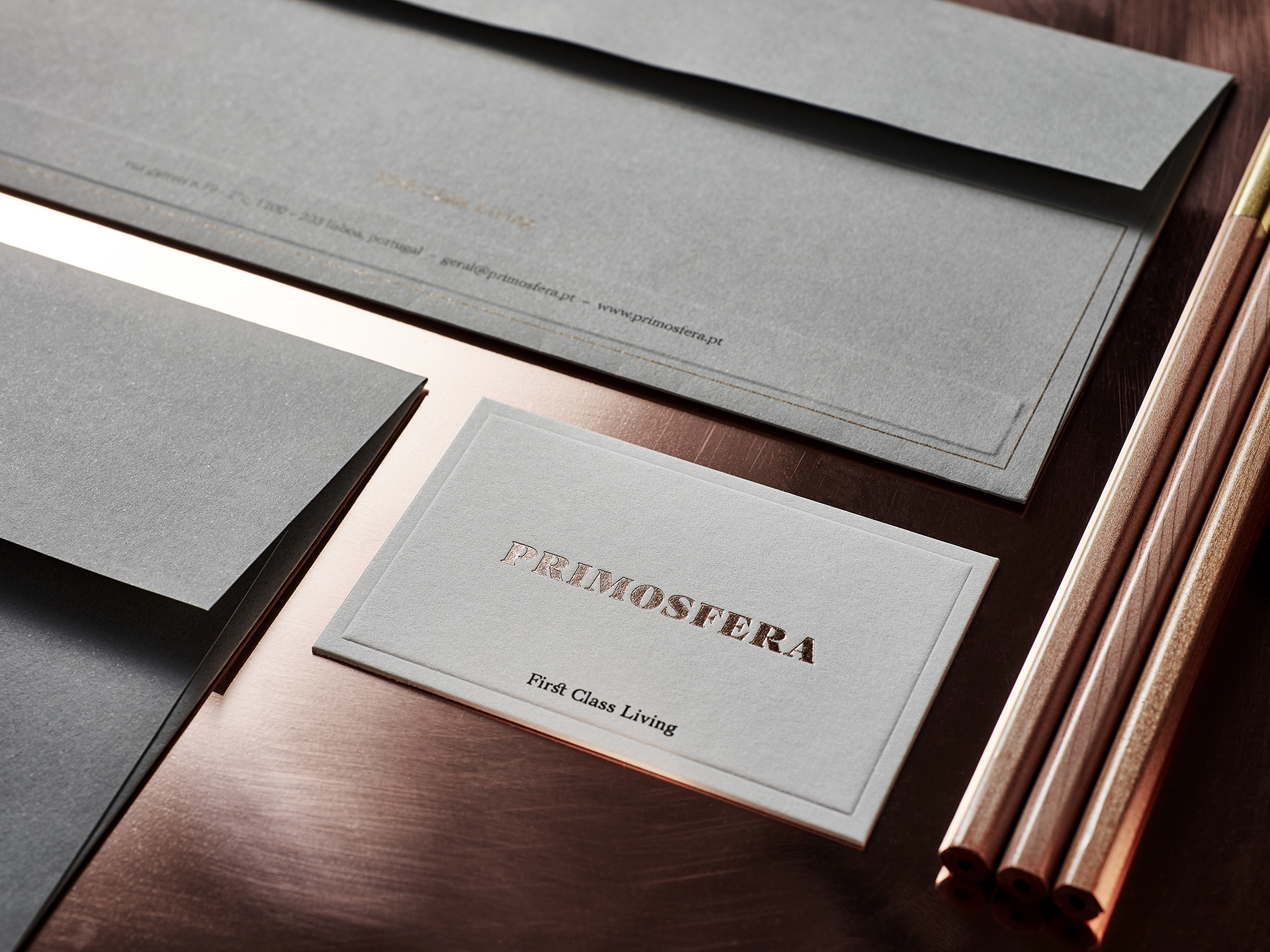
The Brand Identity
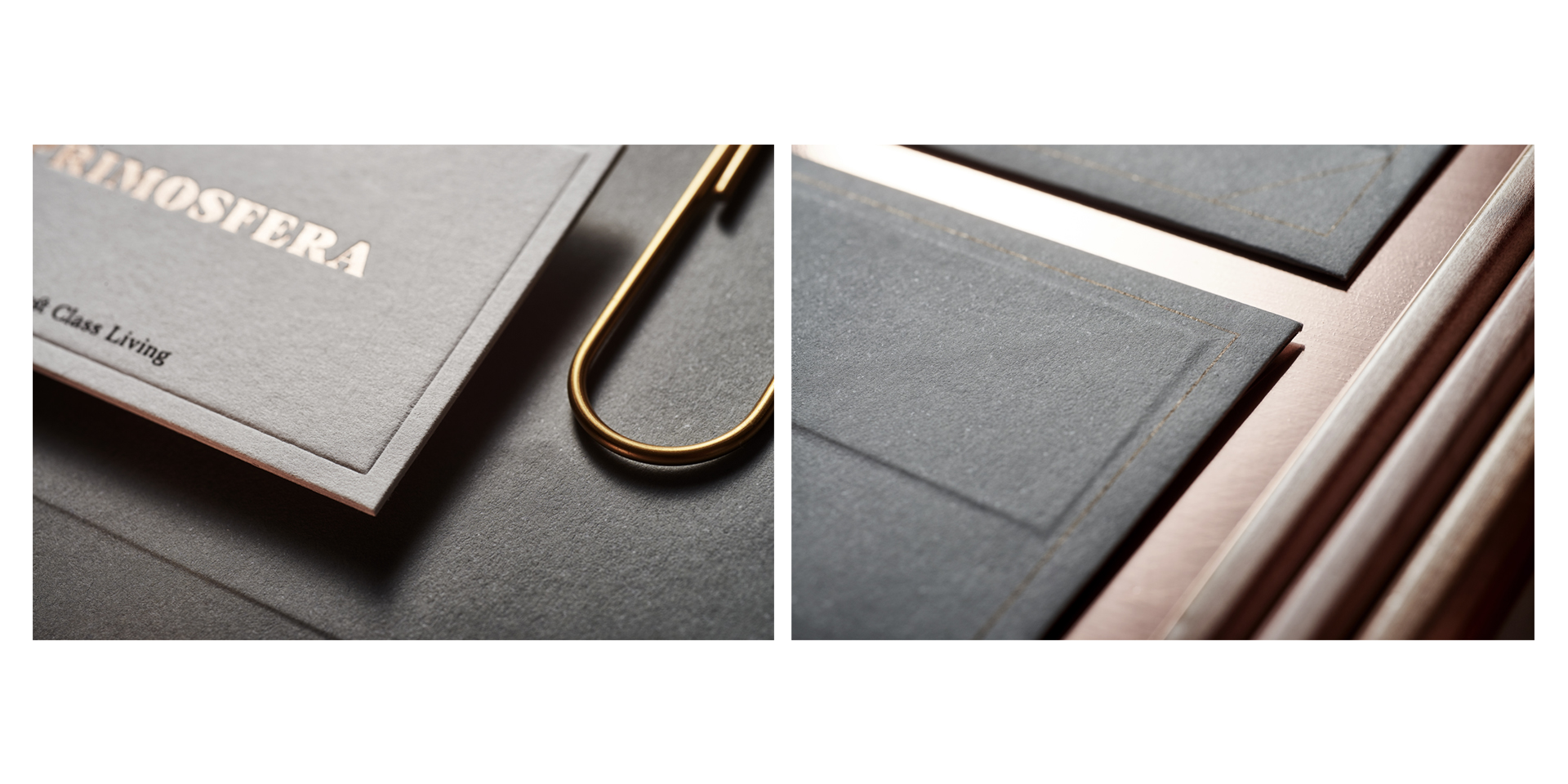
The visual aspect of the brand application is accentuated by lines that draw rigorous but abstract forms that frame the mark in the space and highlight it.
For chromatic palette we chose the Copper (Thermo-Stamped and metallic) Gray and Black. The brightness of the metallic color along with the thermo-embossing stands out from the light gray which is the dominant color.
The function of the Copper is to illuminate the presence of the brand in harmony with the materials and supports used. The balance of color and shapes dictates the behavior of the brand.
Thanks to Miguel Charters, Sofia Charters, Gonçalo Gonçalves, Paulo Cassio e Cassio Store.
Photography by NUMO / Nuno Moreira