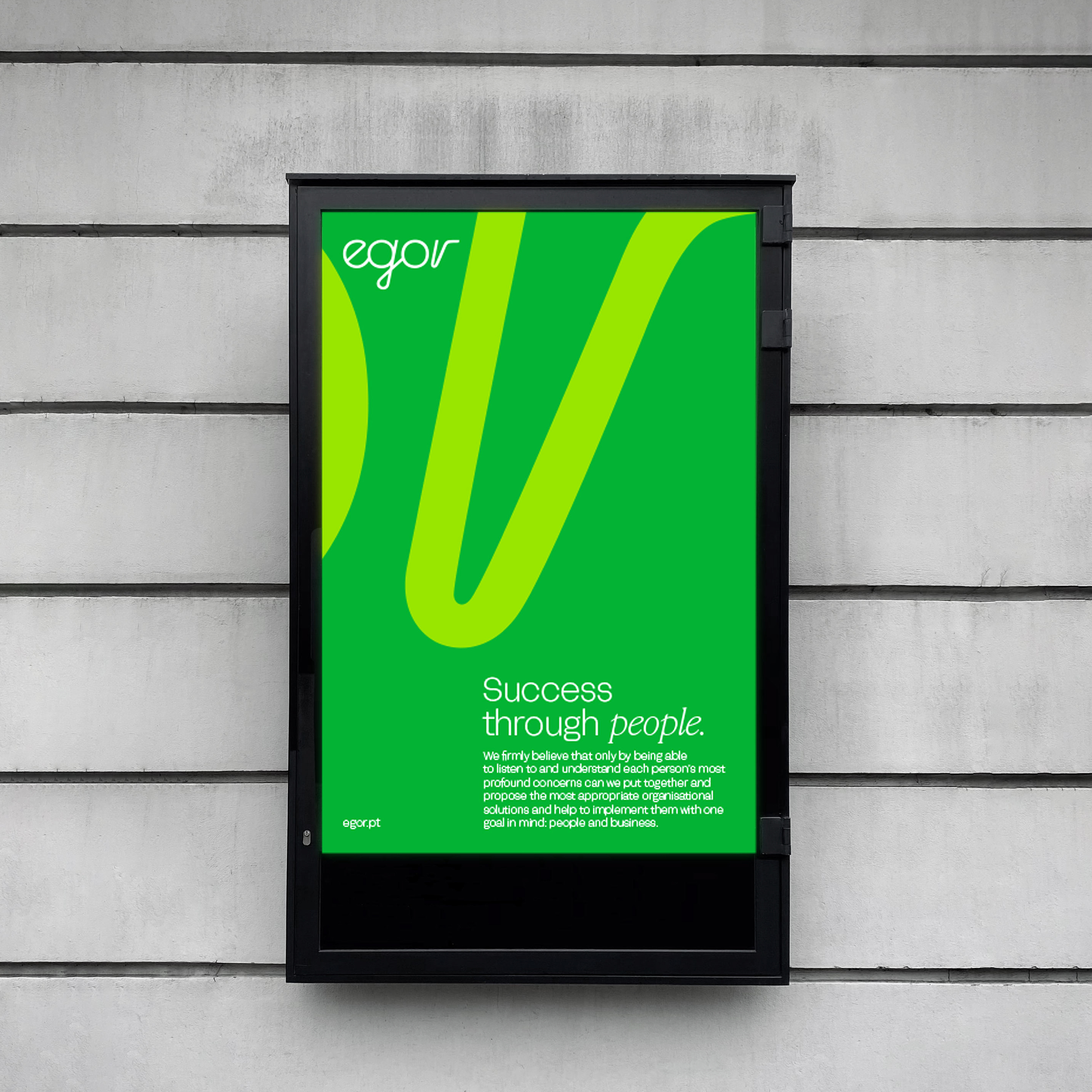
We designed the new Egor identity based on the idea of a brand system, enabling the perception of evolution, growth, and partnership, aiming for a more meaningful closeness. The chosen color for Egor is green. The brand reclaims its color in a more resolute, confident manner. The identity is typographic, in a more contemporary, versatile, friendly, and impactful expression. It’s a timeless and harmonious brand.
Synchro is an associate company of Egor, specialised in outsourcing projects / services, aiming to reduce and ease operating costs, share risks, and increase customer productivity.
It has been designed to embody operational efficiency and agility, all while aligning with the trusted name of EGOR. 36 years of experience, captured in a fresh visual identity.
The Bridge is an Egor associate company, specialized in worker selection and placement solutions for one-off, short-term or unforeseen situations.
Its identity is based on the idea of a new brand that allows the perception of a connecting link, a bridge, development and transition.
Photography: Nuno Moreira,
Motion: Nuno Leites