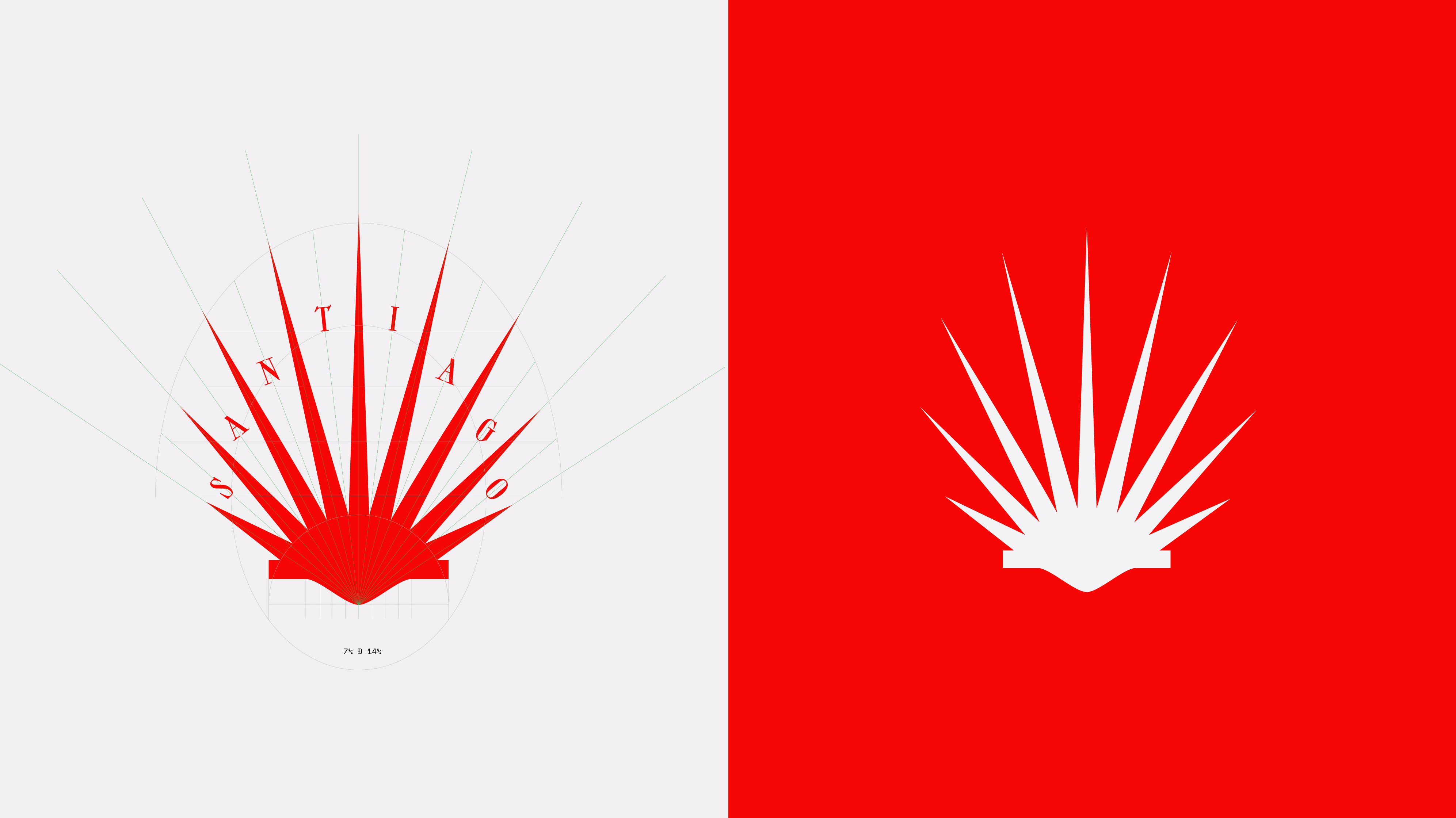
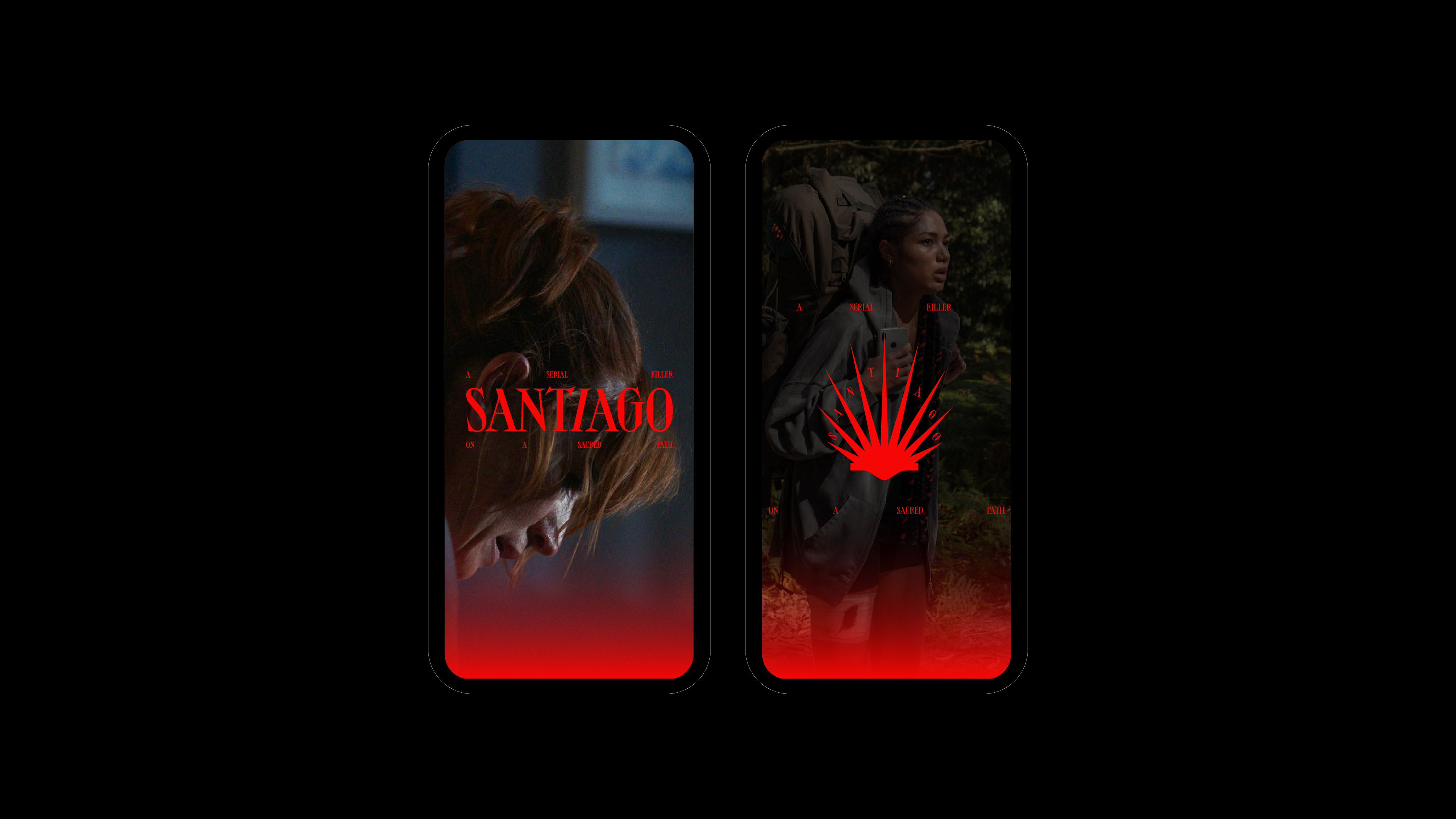
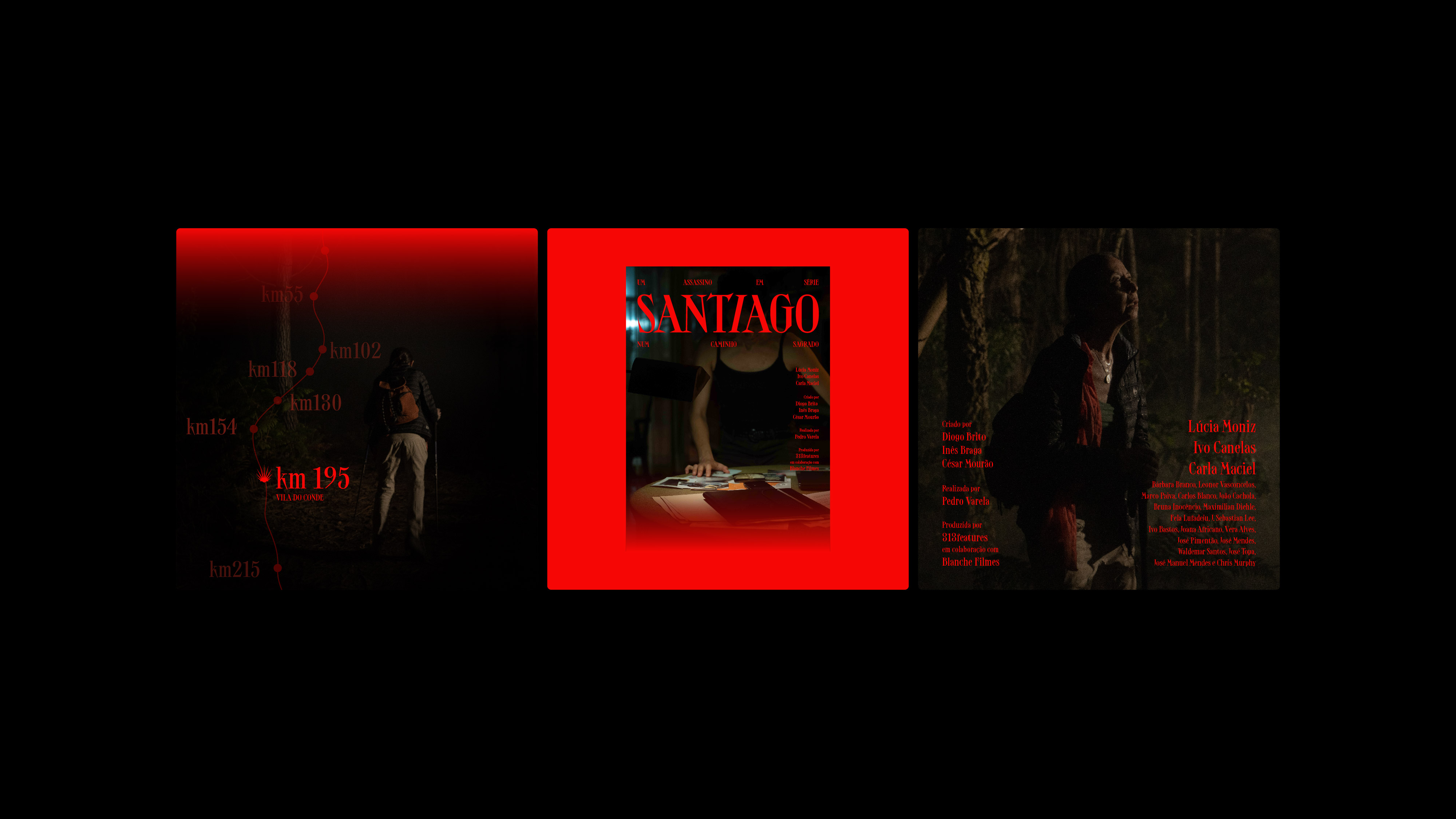
This identity subverts a symbol of reward into a symbol of fatality: The shell became known as the shell of Santiago because when pilgrims arrived in Santiago de Compostela, they received a parchment and placed it on their hat as a reward for the long and hard journey they’ve endured. The most distinctive feature of this identity is the shell turned into a weapon and the subtle blood-drop animation that trickles down from it’s inverted points between the spikes.
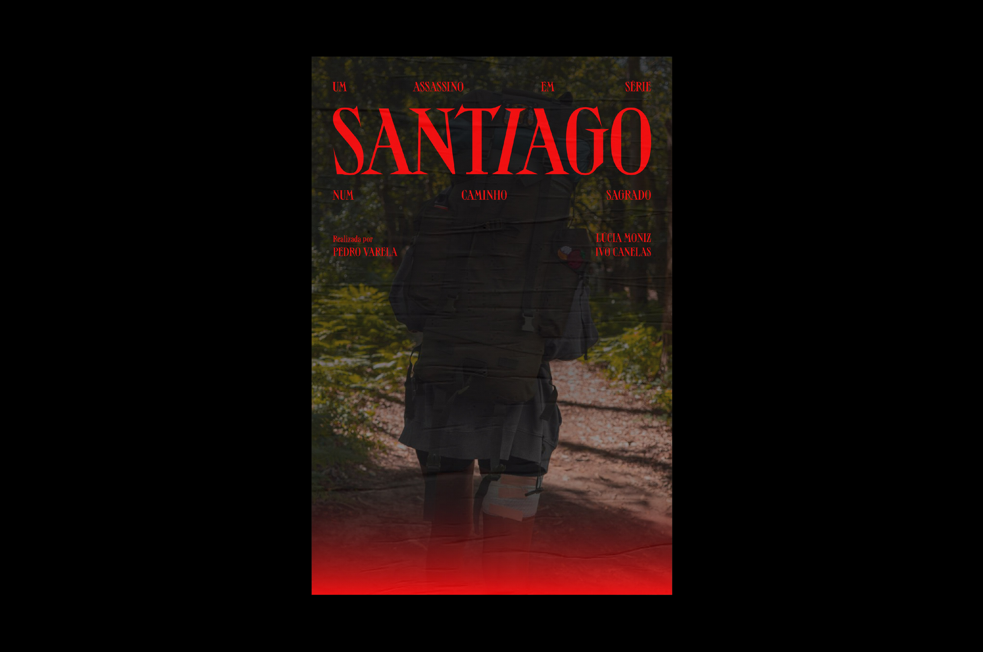
The typography, inspired by the extended letterforms painted on the ancient pilgrim route, is sharp and scathing.
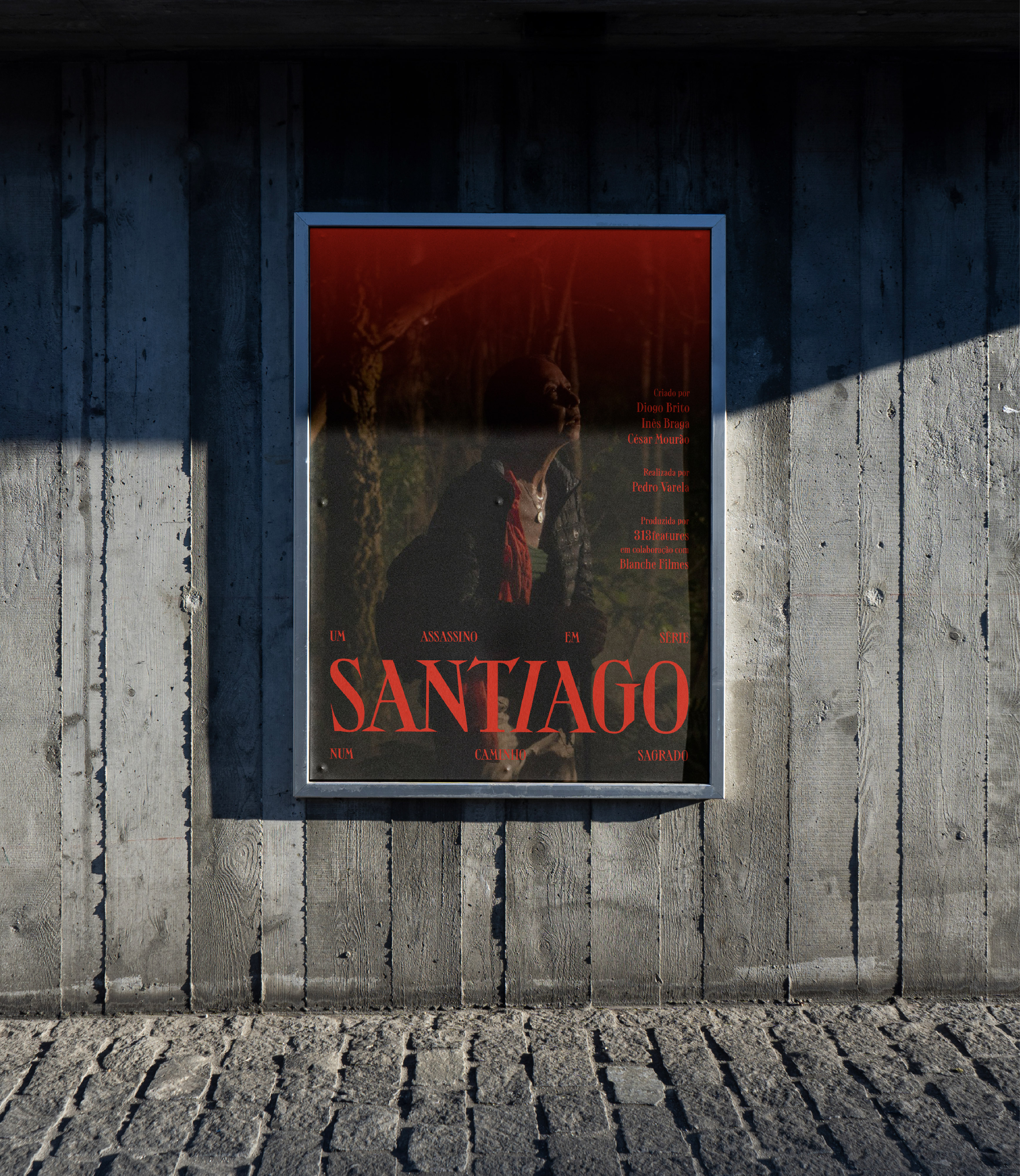
A 313features production
in association with Blanche Films
Created by: Diogo Brito,
Inês Braga & César Mourão
Directed by: Pedro Varela