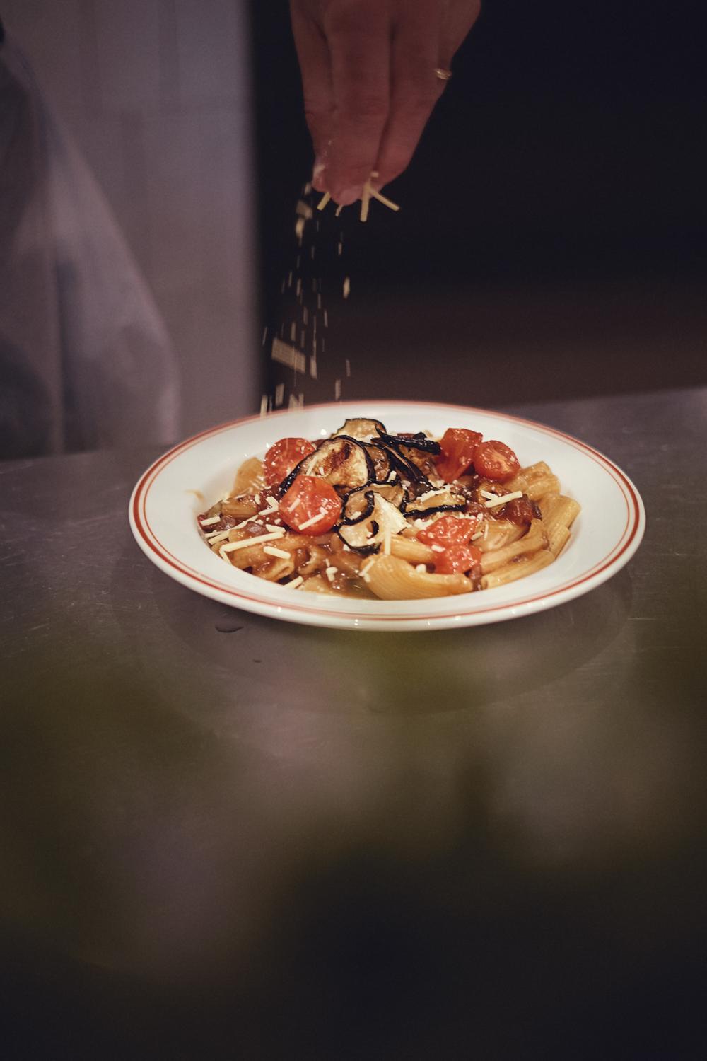
TRA LA Pasta Fresca should assume a relaxed, happy and lively personality. The brand’s attitude should reveal the food preparation environment: involved, cheerful and dedicated.
Pasta made from scratch, on the spot, and fast.
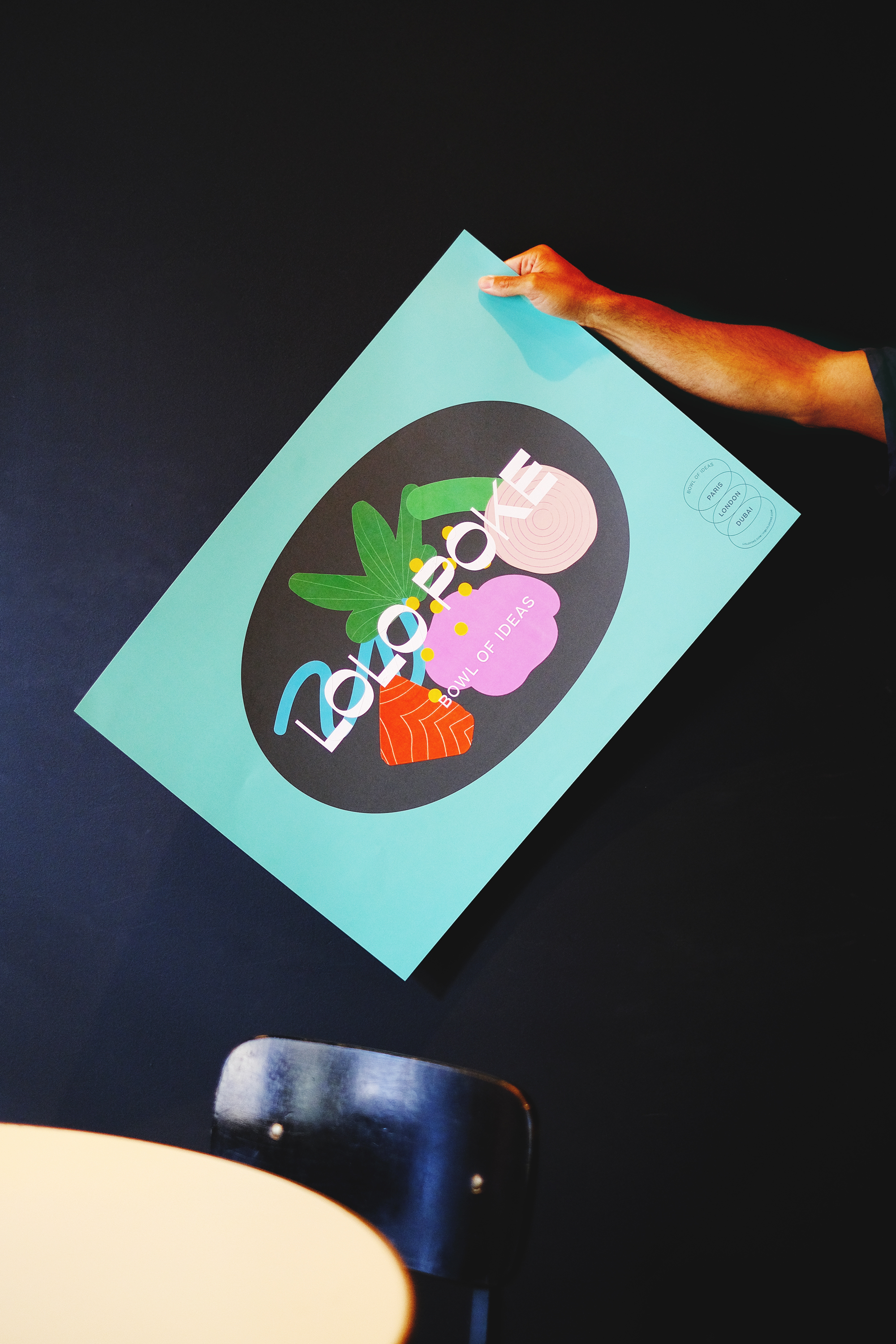
The motto was to visually explore the identity of the imagery of fresh pasta and the human figure with a distinctive and recognizable attribute using illustration and color. Explore visual expression through shape and cut and behind the strong color illustration. A brand that you want to eat.
The identity is based on typography with an elegant and unique curvilinear design, immediately recognizable and empathetic. The design of the typographic elements allows an immediate association with flavor, origin, and fun. It has striking angles of contrast that create a strong personality.
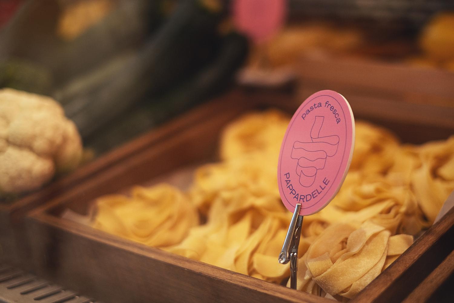
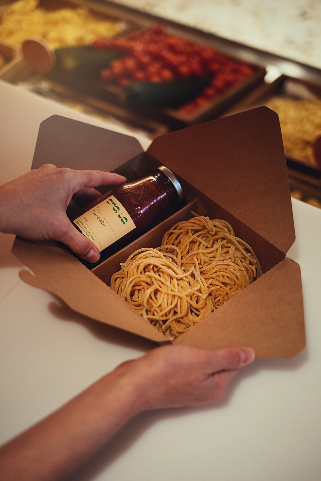
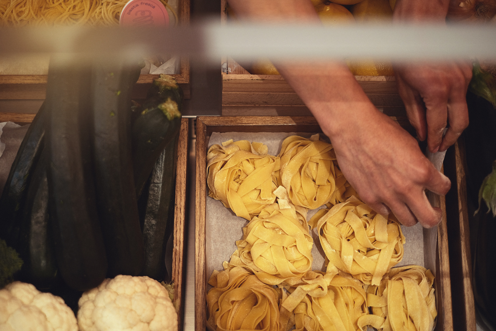
Illustration: José Cardoso
Motion: José Teixeira
Sound Design: Pedro Marques
Photography: Numo / Nuno Moreira