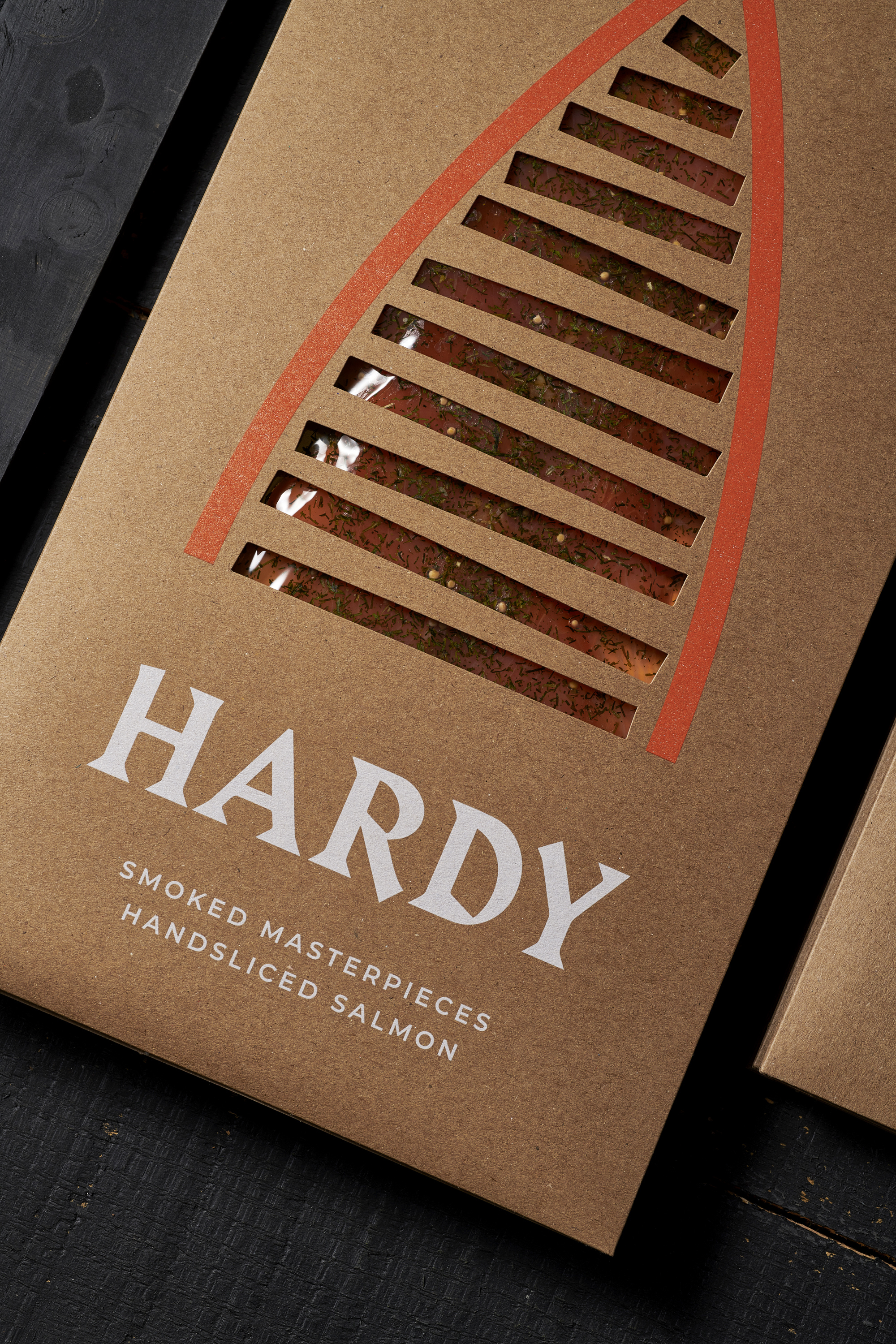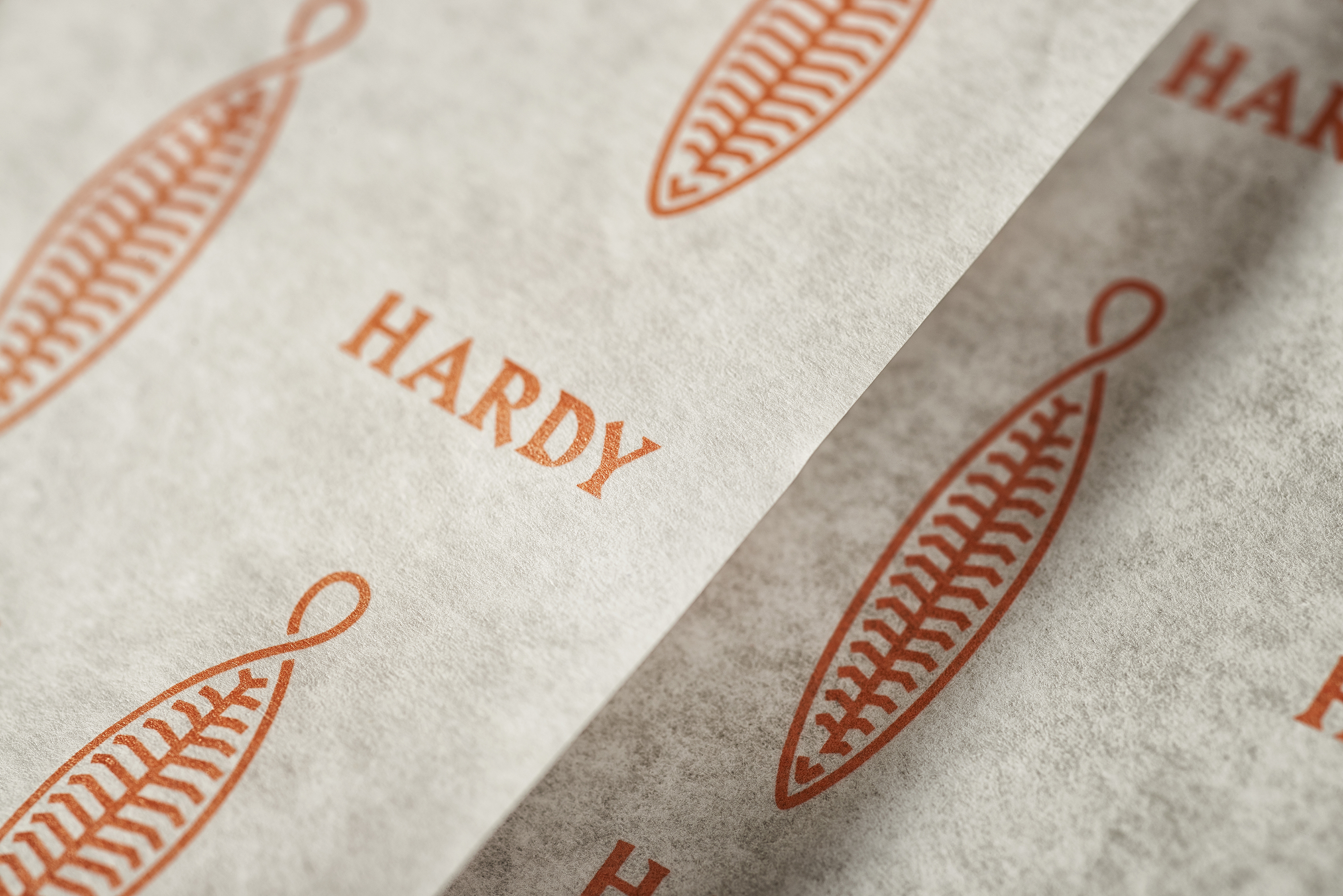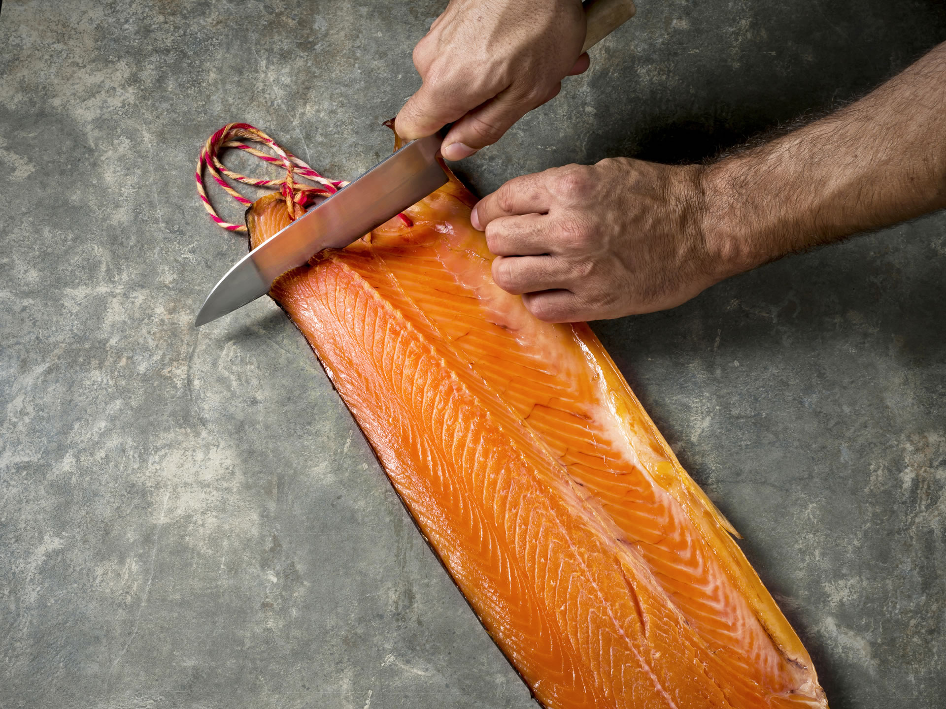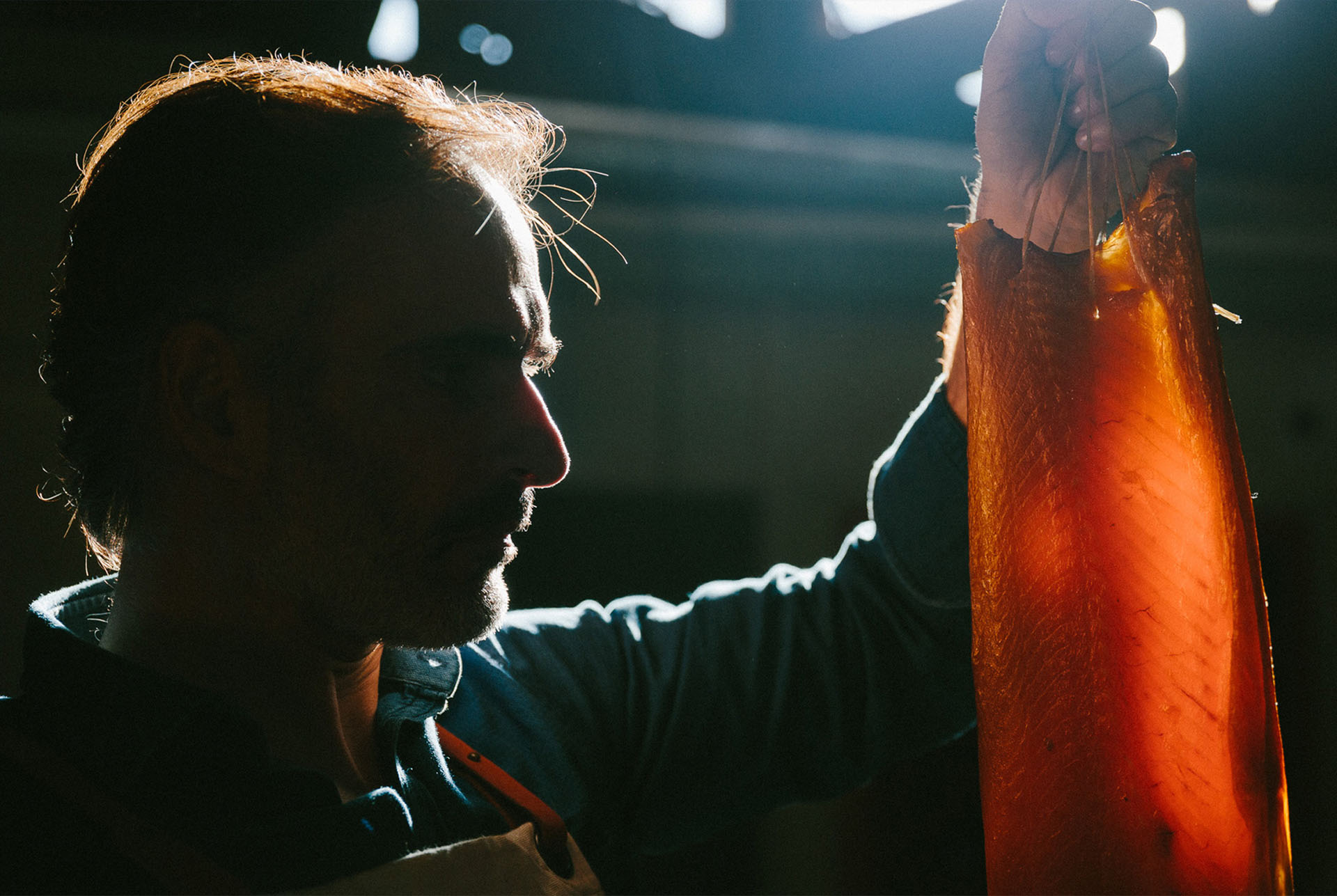
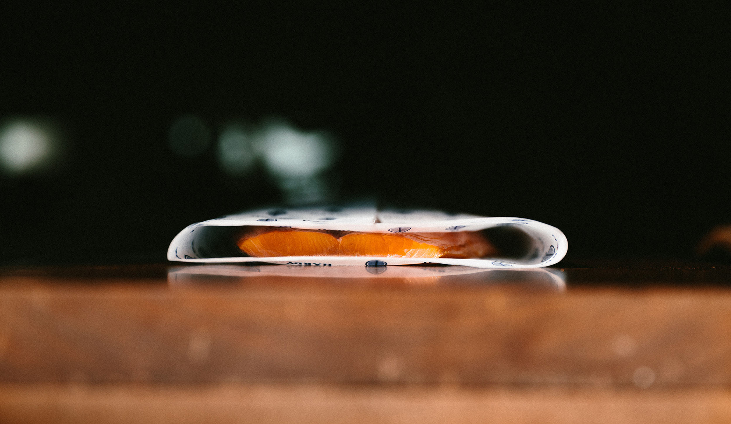
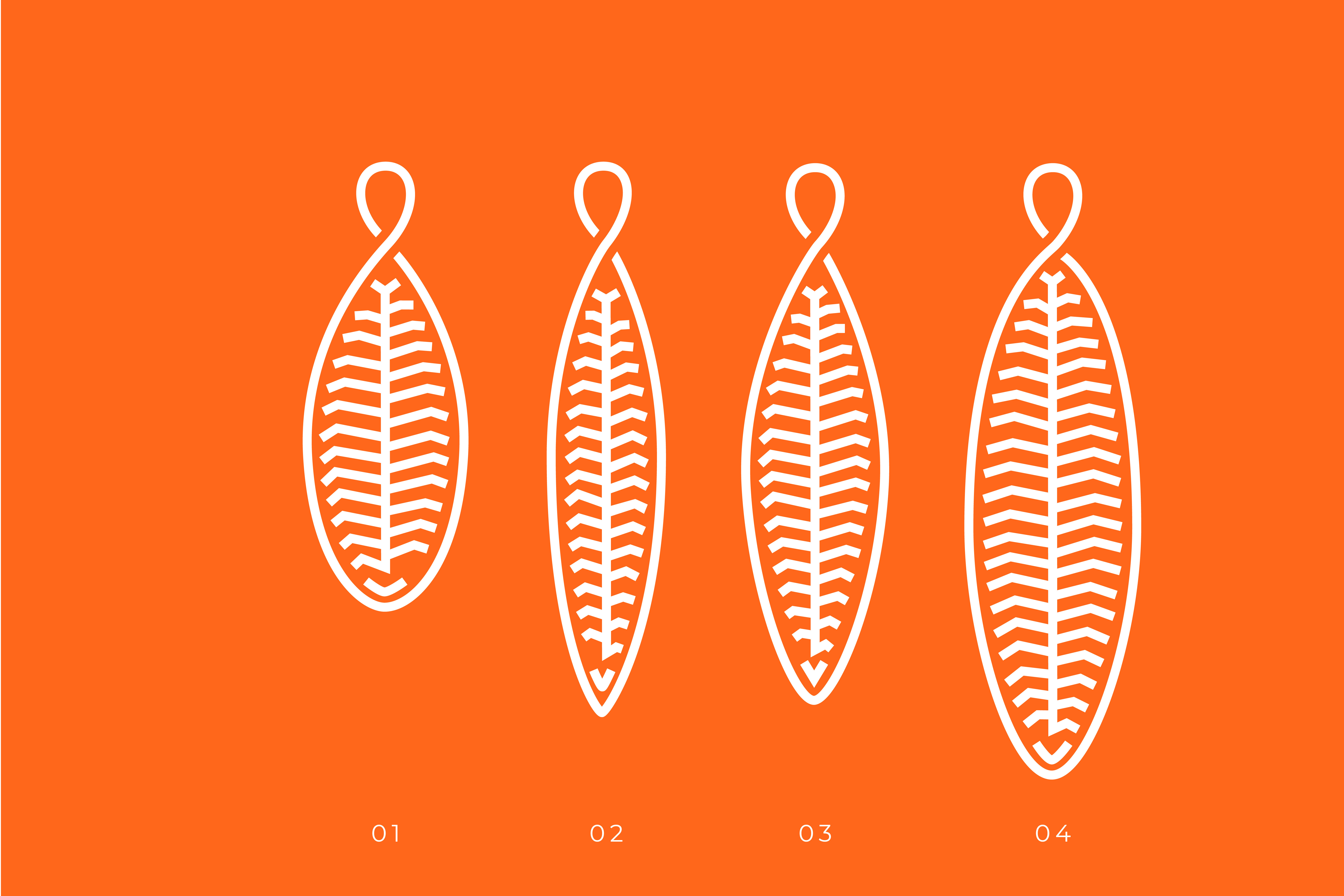
Hardy’s graphic identity results from two main ideas: the use and manipulation of a strong typography that evokes a Germanic aesthetic, rigid and sharp as a cutting knife and the symbol that reproduces the Hardy process, the salmon fillet, with its texture and repetition of pattern, and a drawstring tie that binds it to the smoker.
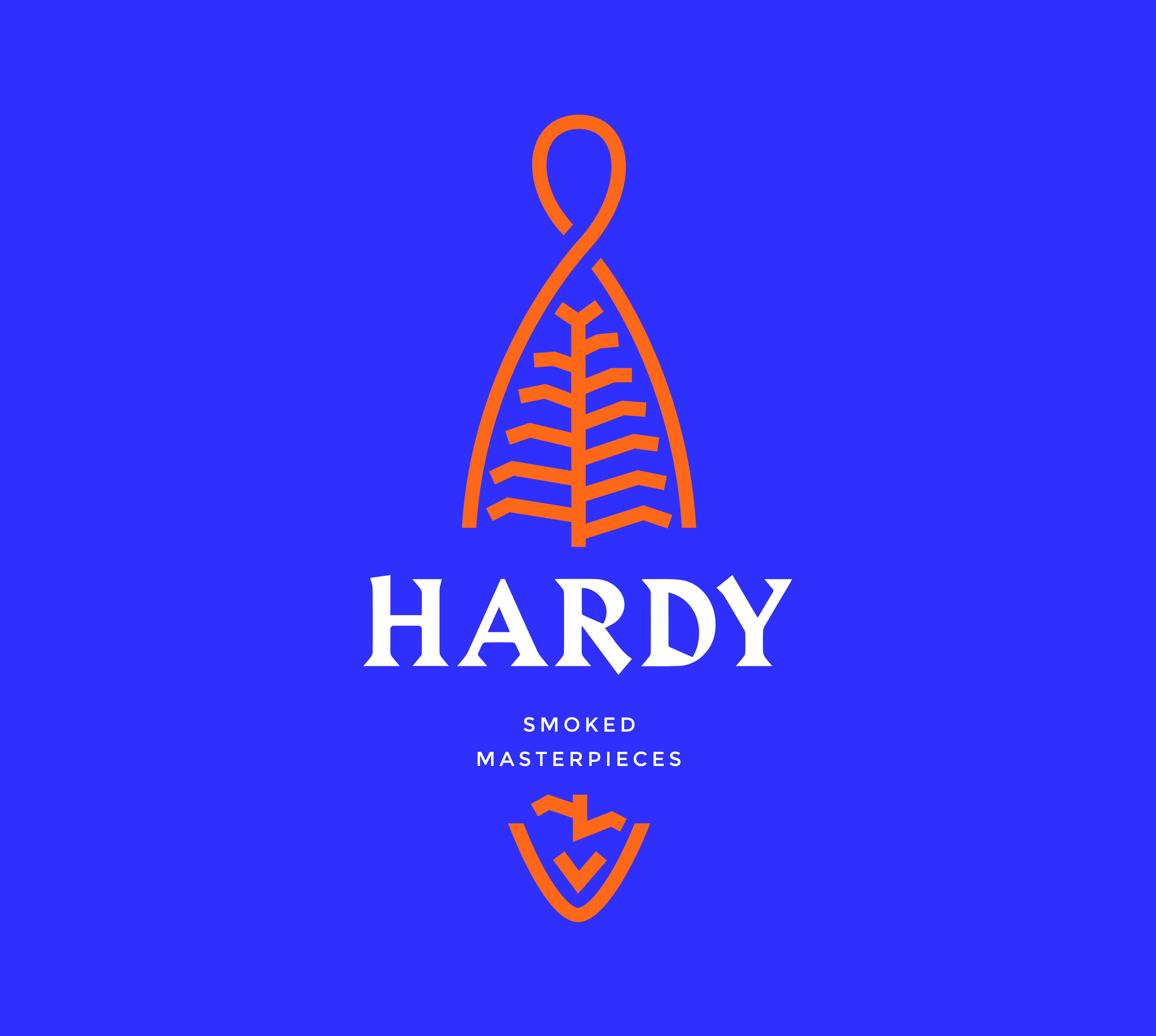

The visual representation of the fish is adapted to other fishes in the Hardy portfolio, such as the slender and longer Eel, the Mackerel (small and group) and the extension to future new products. The chromatic palette was defined with great care: the salmon orange and a deep blue exist in balance and in alternation.

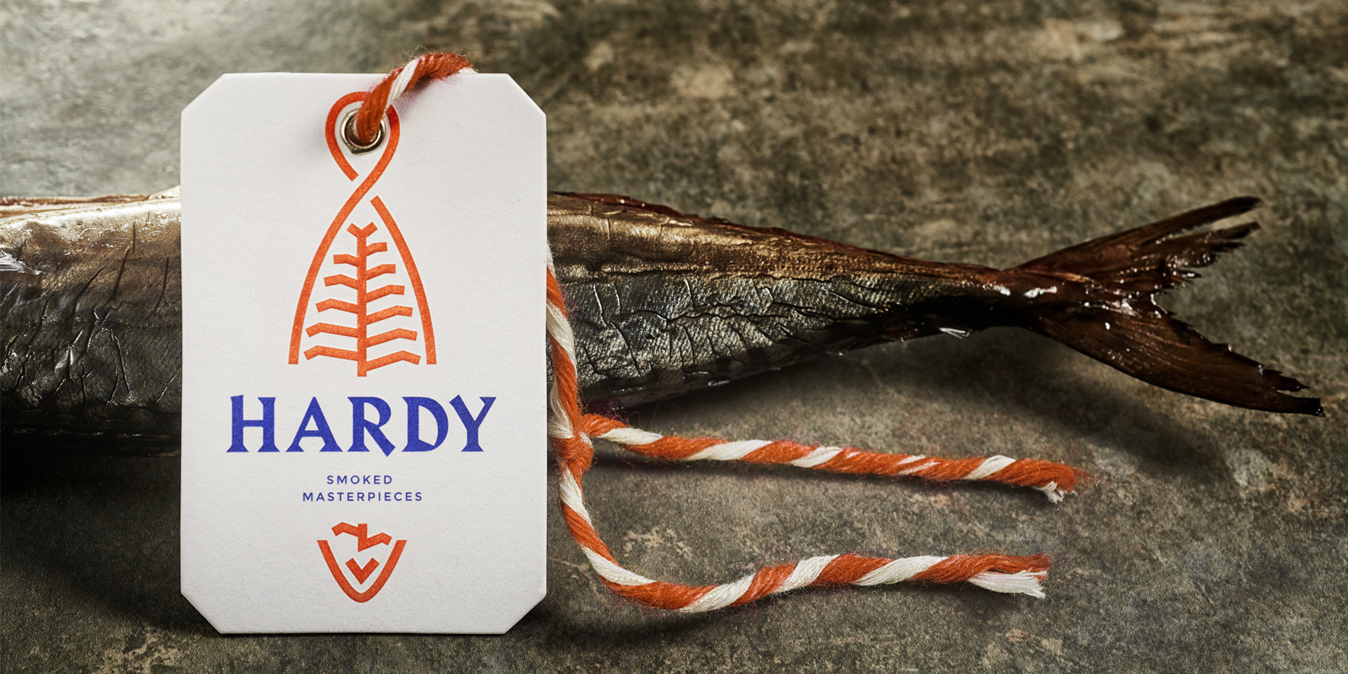
In 2021 we finished Hardy’s full set of 4 packaging: 1200gr, 700gr, 240gr and 120gr. The concept and expression of the brand are now materialized in a packaging that respects the origin, the preparation time and the flavour at the time of delivery.


