Metáfora (Metaphor) is an olive oil with a millenarian blend created from ancestral olive trees that preserves the timeless qualities of an olive oil where a living metaphor of a region is kept. An oil that extracts the pride, authenticity and wit of the Transmontano people.
An identity that convey the essence of Transmontano Olive Oil (considered the best Portuguese olive oil region) to the international market.
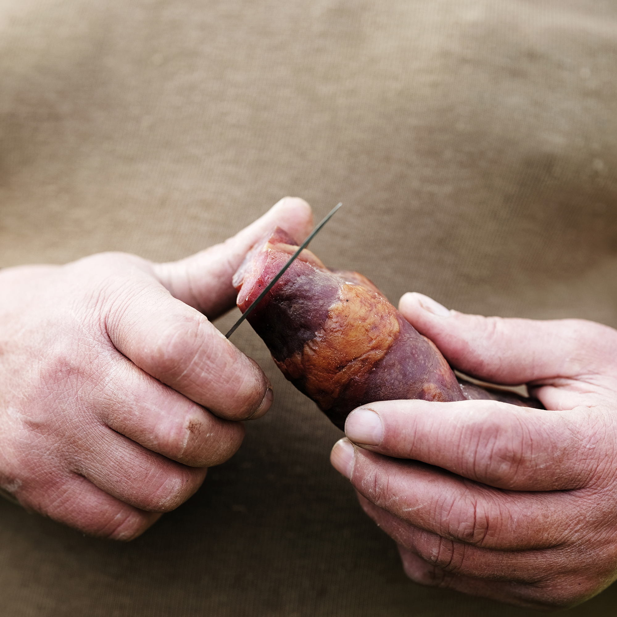
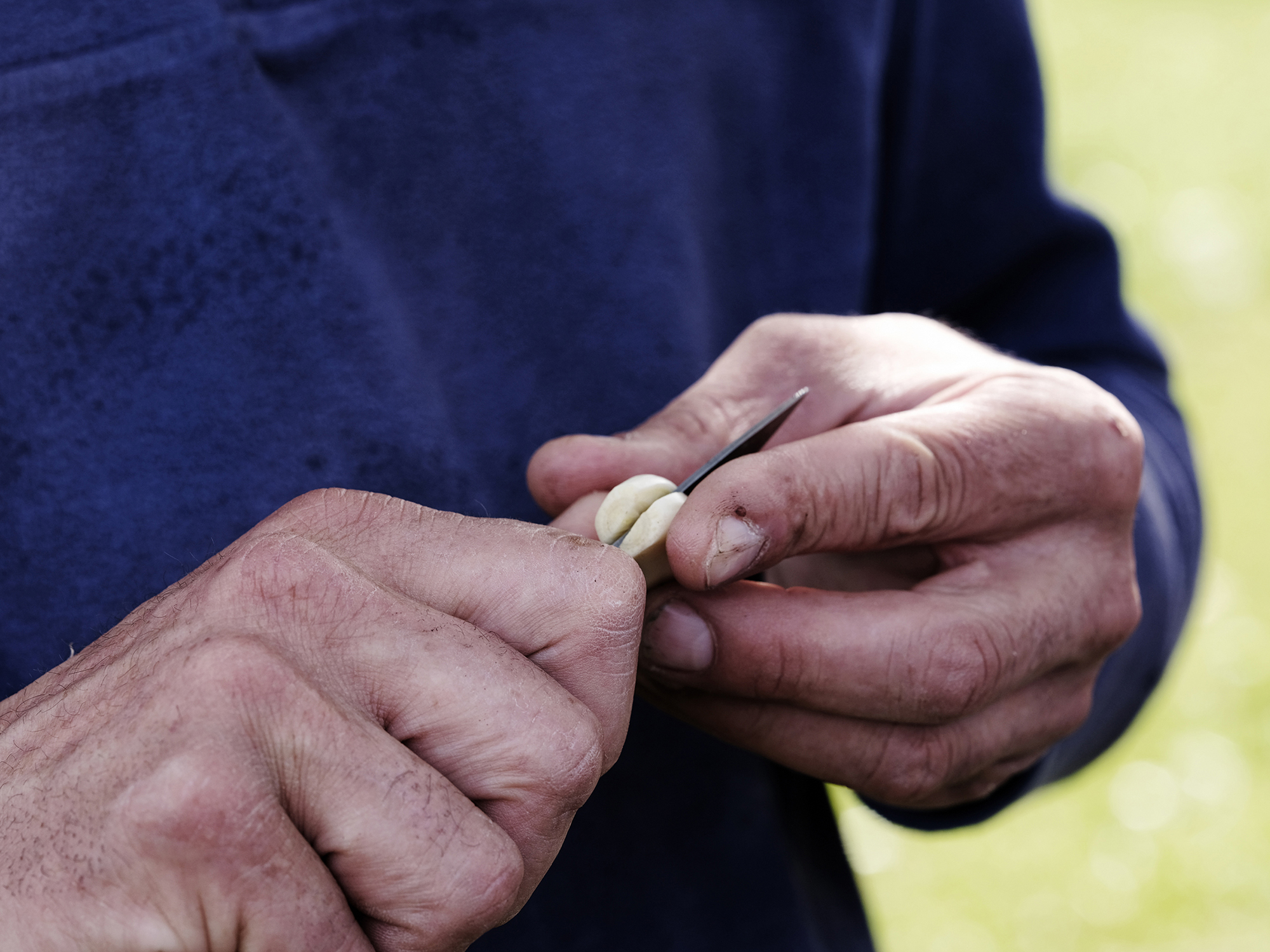
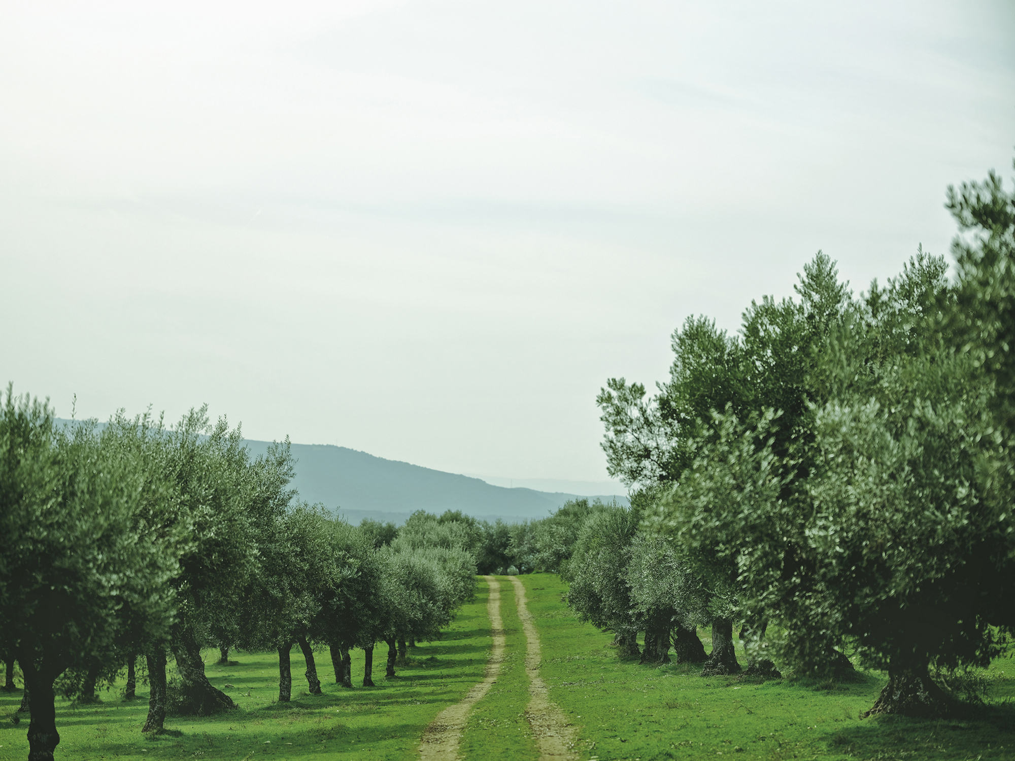
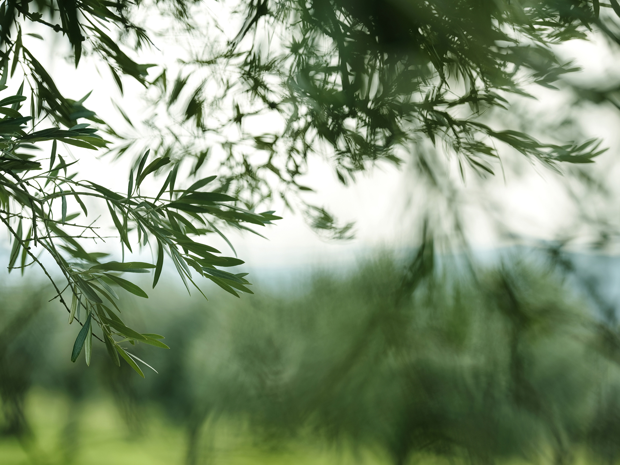
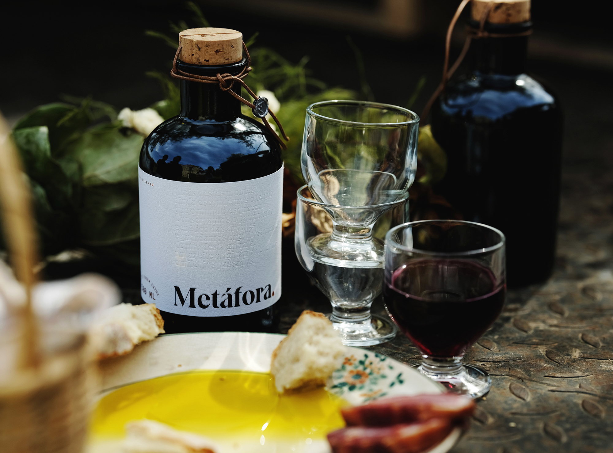
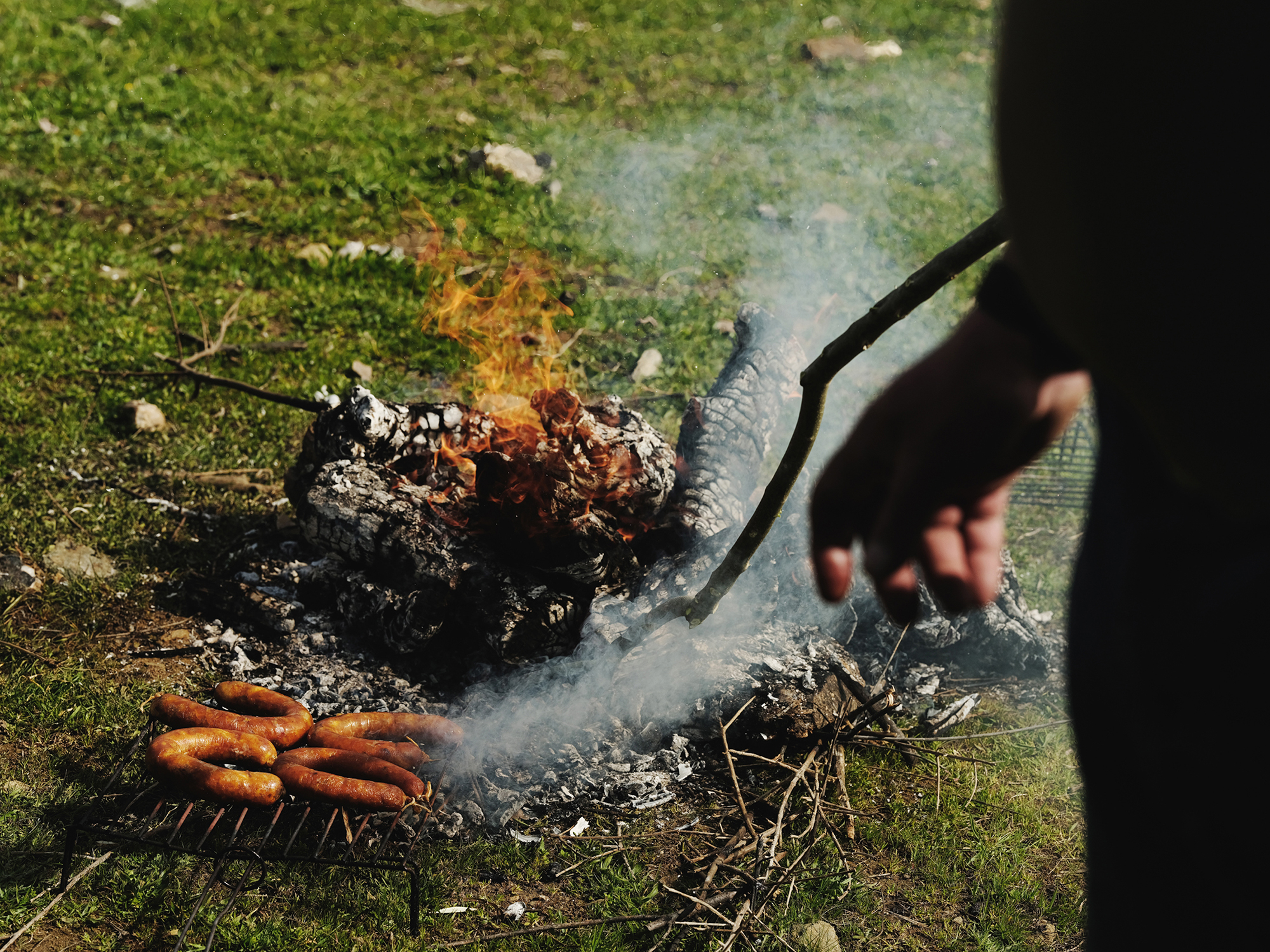
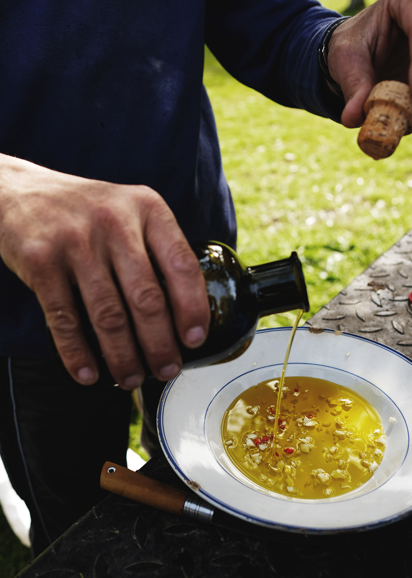
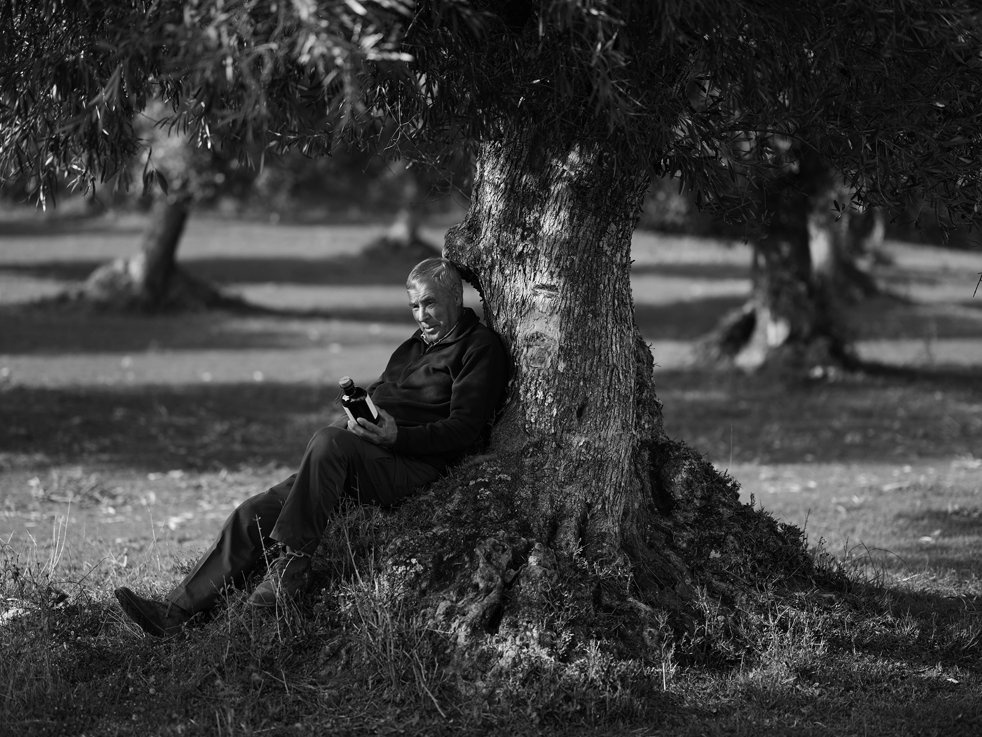
The photographic approach of the product is exploratory, it wanders through the local routines and finds the deep humanity in the most common gestures. To present the nature of the olive oil we made a traditional snack with olive grove workers. Ground fire, local meat and taste of olive oil next to millenarian olive trees. The photographic session results in a commendation of the earth and the people for a world of forgotten flavors, hands and faces with winter sun and the scent behind the mountains. The reaction of the Trás-os-Montes people was of pride and representativeness in a product that reveals the memories of their land “behind those hills” to the world.
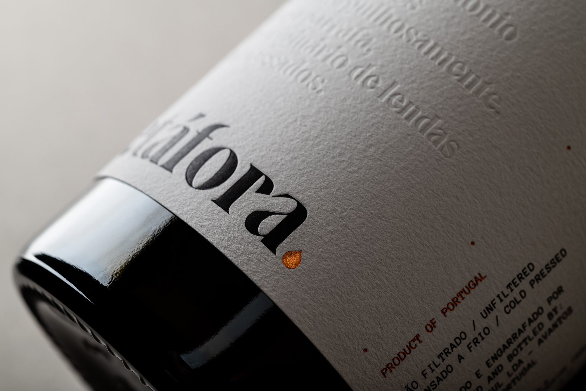
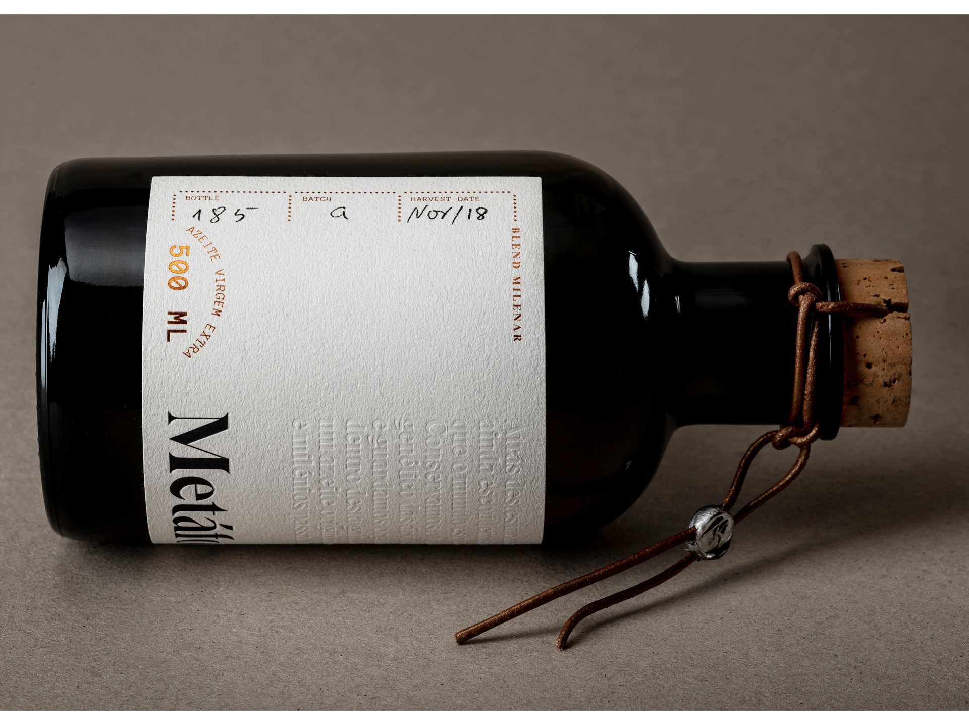
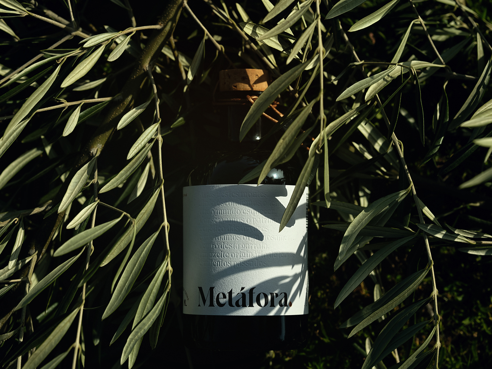
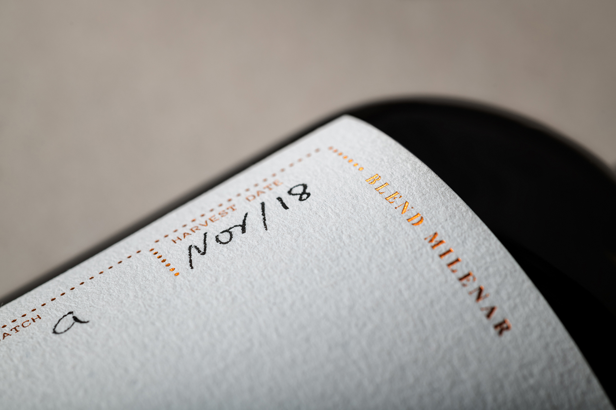
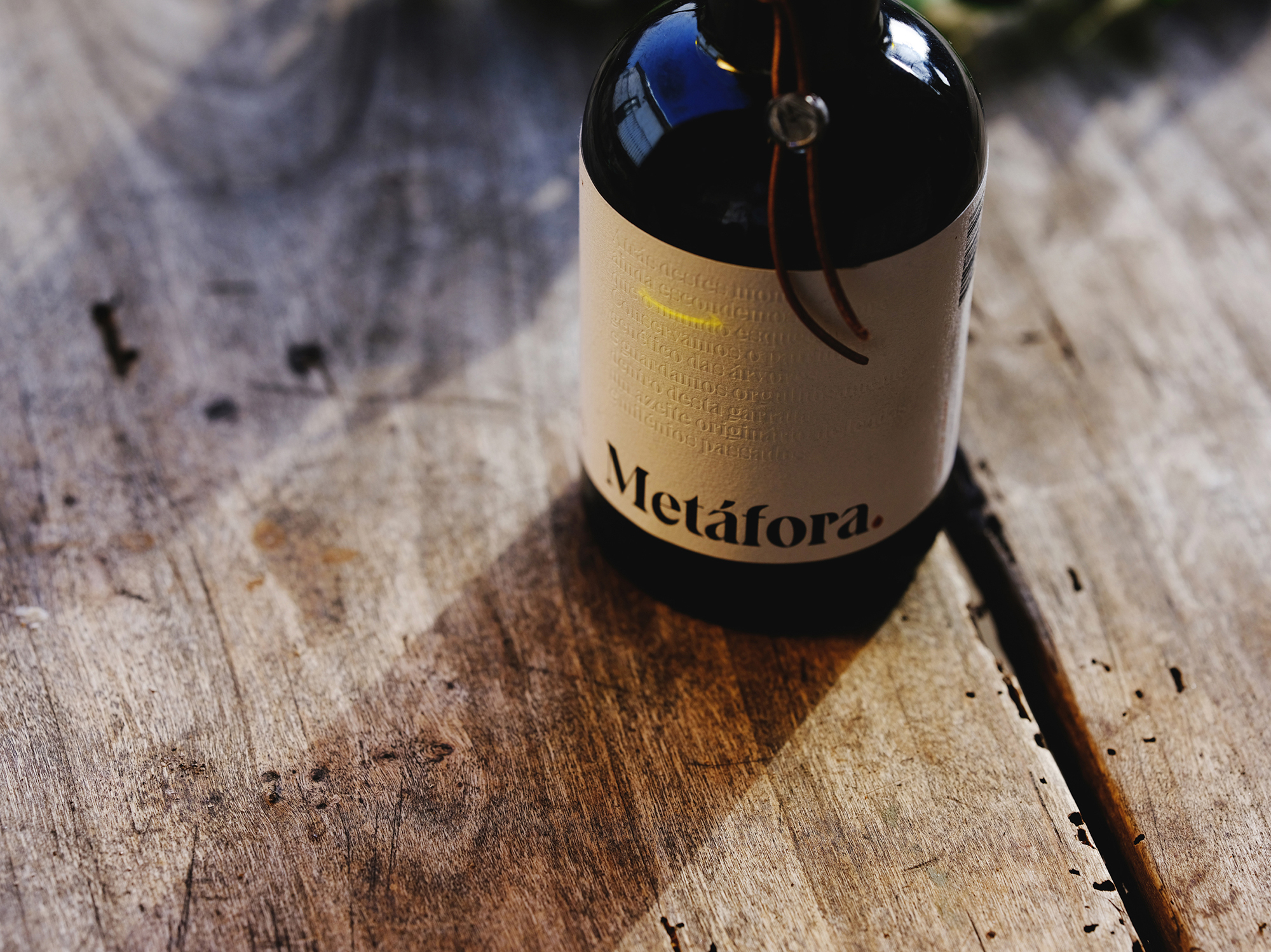
The minimal approach of the logo favours the relationship between the purity of the product, its character of selected olive oil, and the craftsmanship and care that one wants to communicate. A charismatic and serifed typography was used, historically linked to the written word, identification of the manufacturer, batch and hand-written bottles helps to contextualize a craft scene. The chromatic palette is neutral, with metallic color notes. Priority for the written word: label with text, for those who have time and value reading. Not for hurried people. Use of metaphors as a graphic element, whose theme must be related to the universe of olive oil, through the exploration of words such as mountain, river, tree, forest, field, etc.
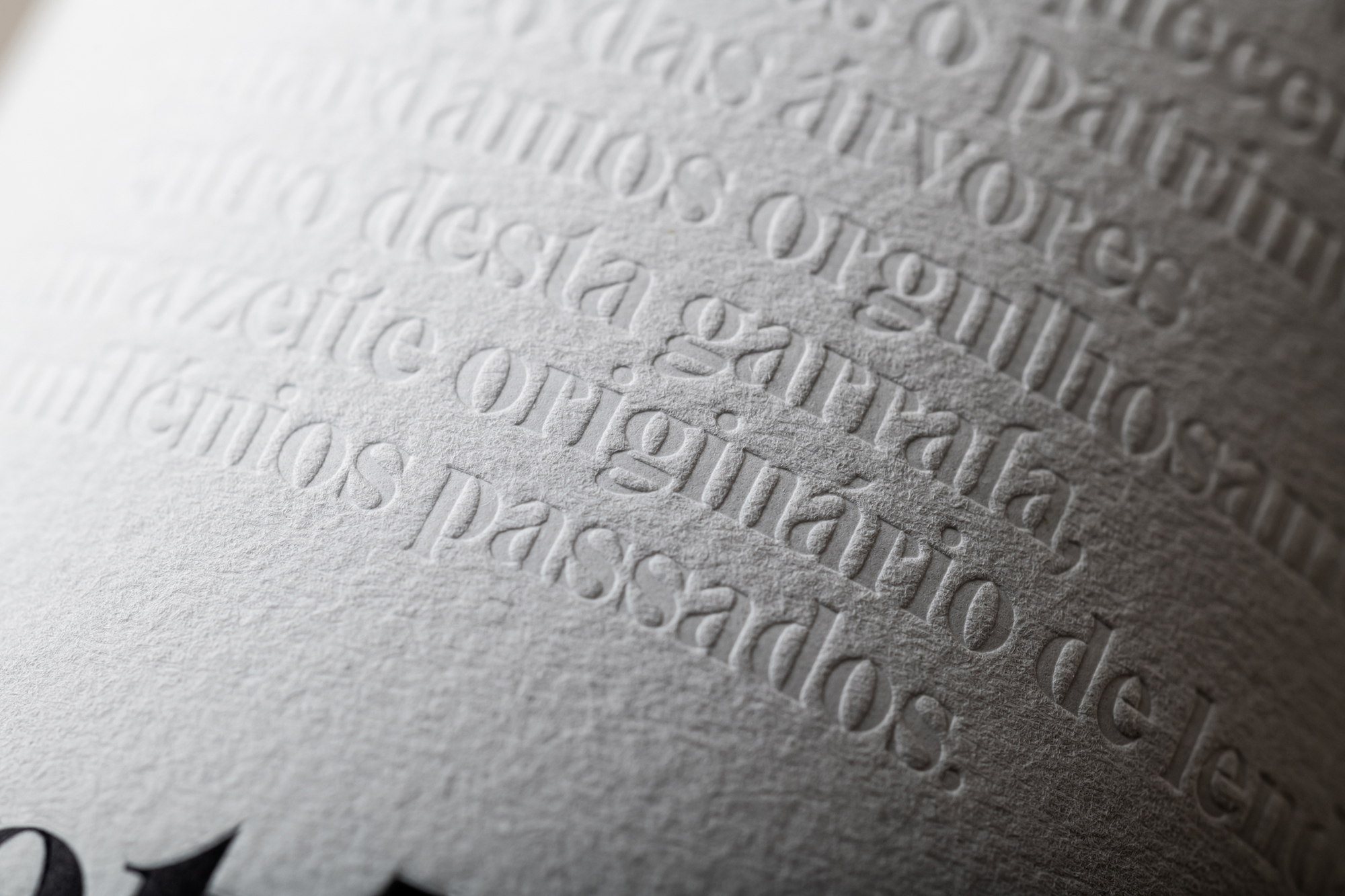
Low-relief text on the label (which is a metaphor for the cold and manual method of pressing the brand’s olive oil).The text on the label in its entirety: Behind these mountains, we still hide the time the world forgot. We preserve the genetic heritage of the trees and proudly hold, within this bottle, an olive oil originated from past legends and millennia.
The geographic isolation of Trás-os-Montes, region of Northern’s Portugal, followed by a meagre social and economic development, allowed to maintain a cultural heritage that inspired its people to live in harmony with nature and to collect the fruits of a land where it chose to stay was the inspiration of a short film that introduces Metáfora as a strange phenomenon.
This project has many hands.
A huge thanks to the team that pulled this together with such positivity and enthusiasm, especially: Artur Serra Aráujo, Zézinha Araújo e Fernando Cruz.
Photography: Numo / Nuno Moreira
Video: Artur Serra Aráujo
