With the development of a new brand architecture for its DOC wine range, Kopke sought a distinct identity: premium yet unpretentious, contemporary yet elegant. The goal was to stand out at points of sale, differentiate product categories, and craft a compelling brand narrative. The biggest challenge? Establishing its still wines as independent from its Port wine heritage, giving them a voice of their own. The solution lay in going back to the source—the Quinta where all the wine is made.
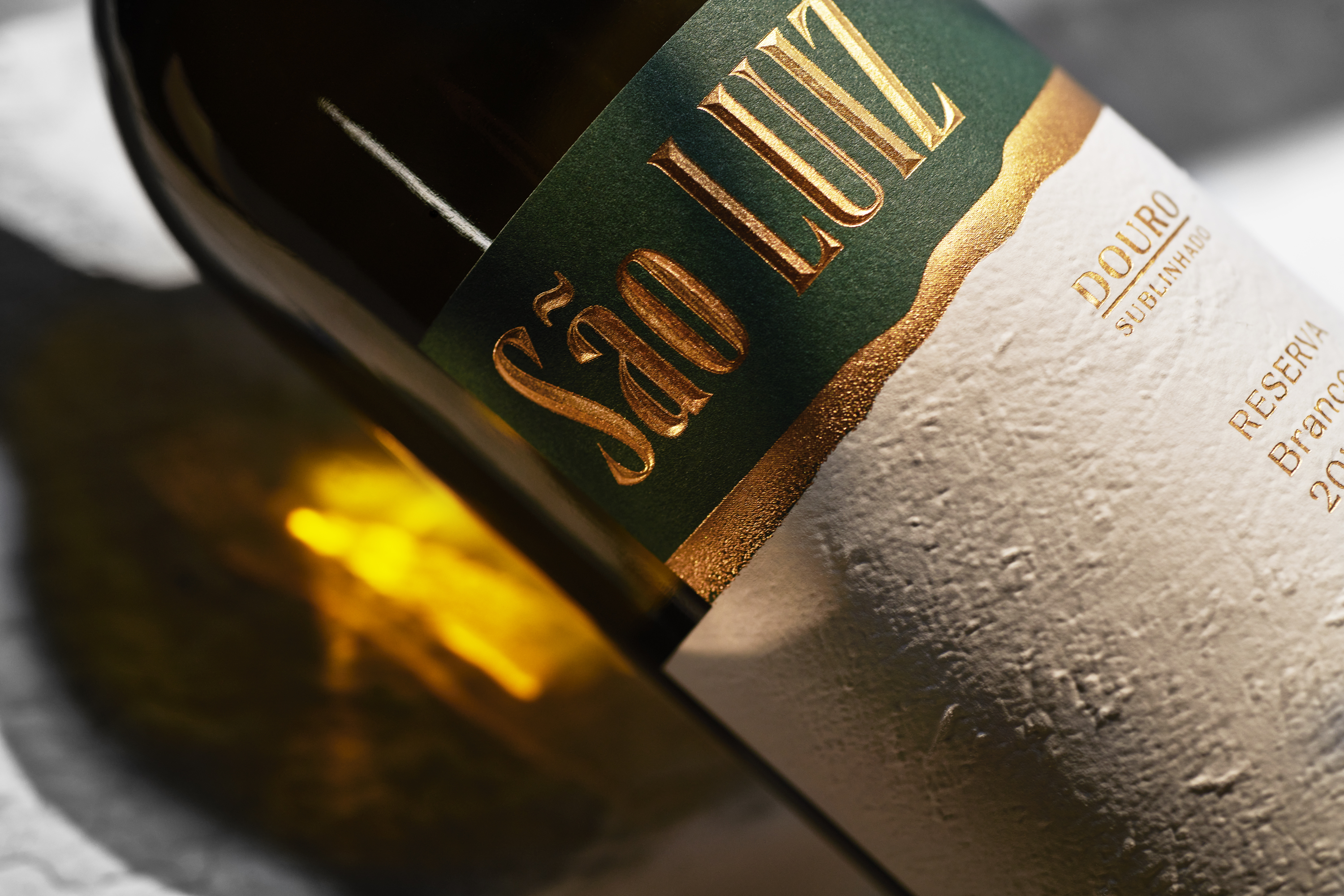
The terroir of Quinta de São Luiz, in the heart of the Douro, now takes center stage in the brand’s storytelling. Inspired by the longstanding tradition of painting the Quinta’s walls white, this visual cue unites the surrounding community and invites the public to share in the heritage sustained by these vineyards.
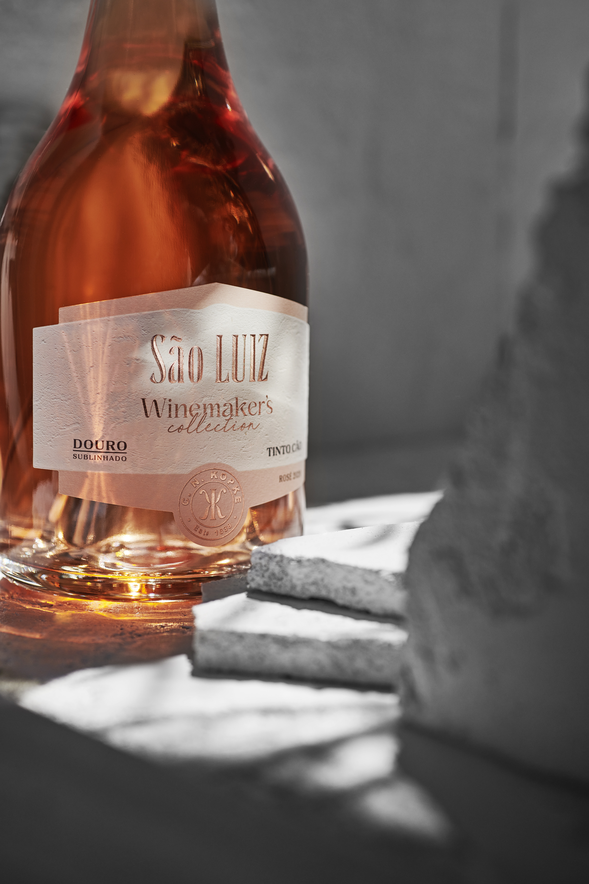
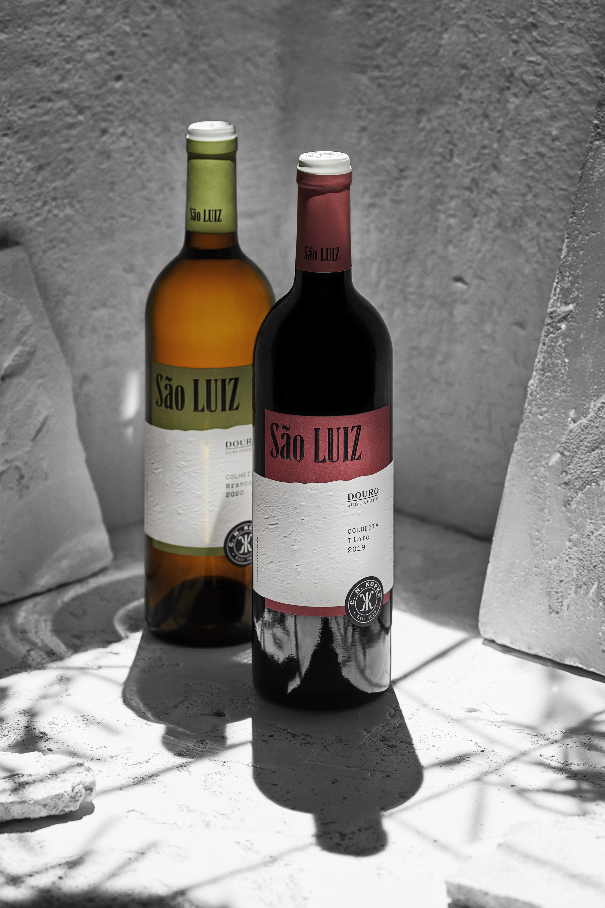
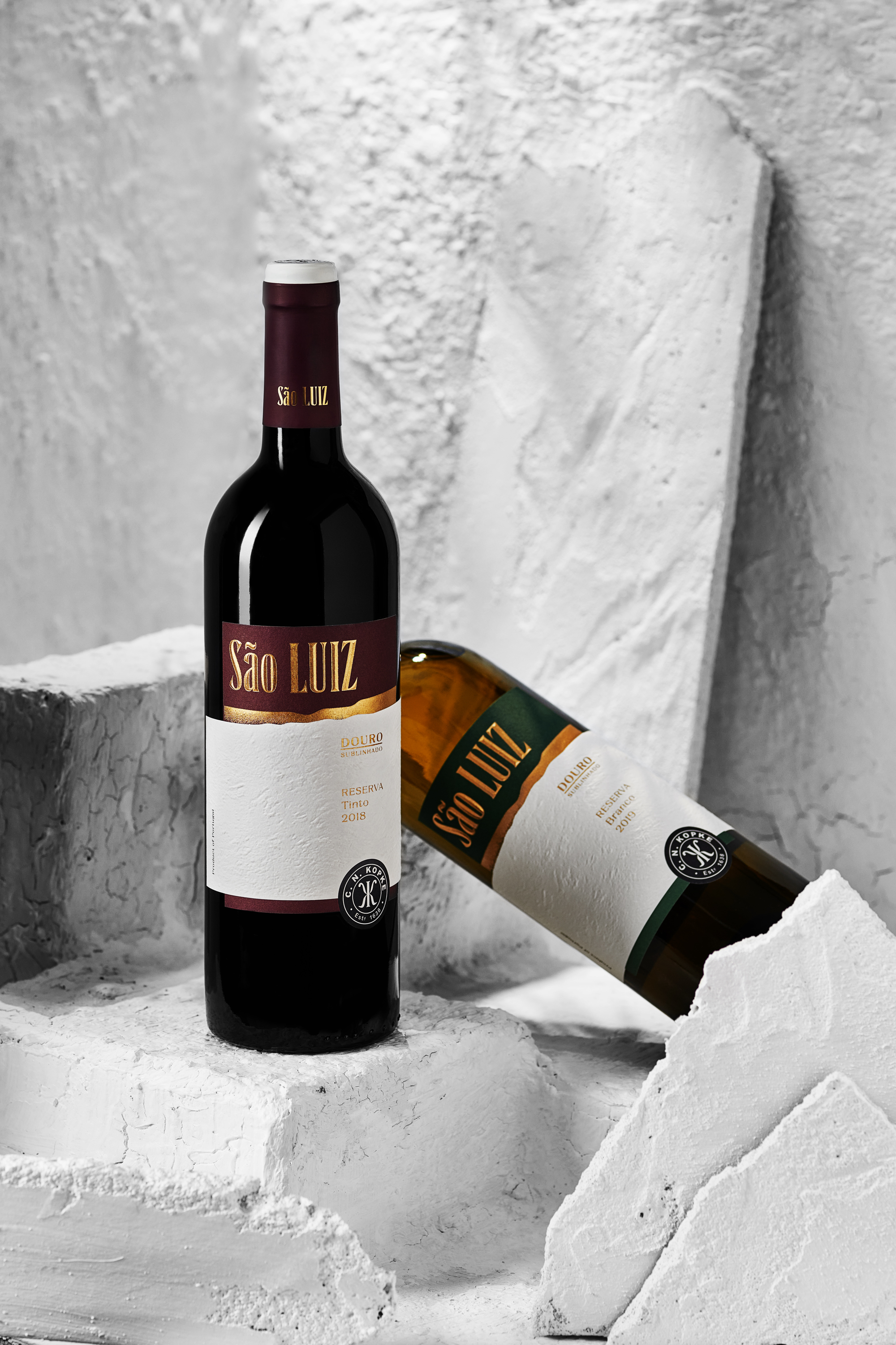
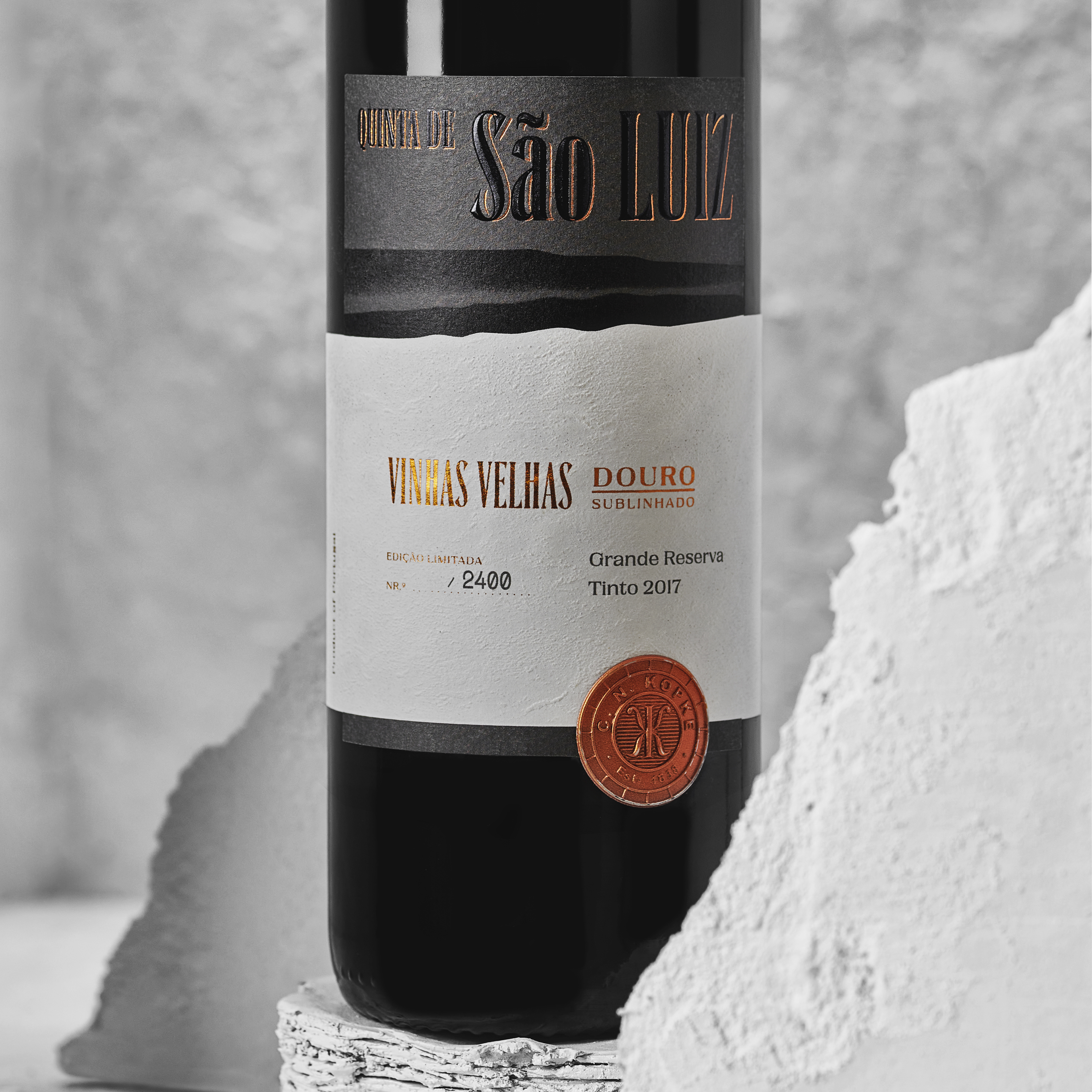
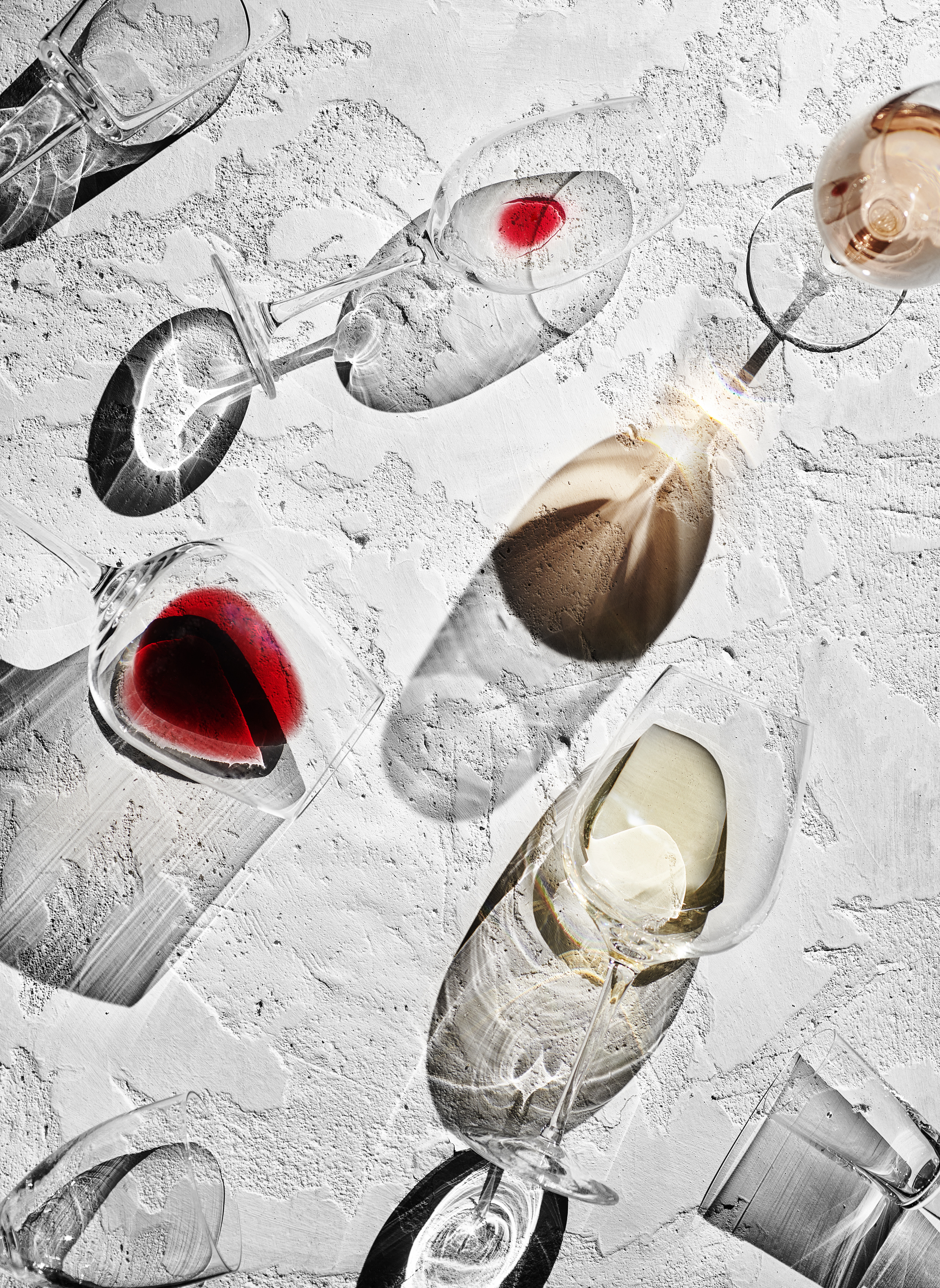
This connection to the land is reflected in the label design, where the textured, elongated “mural” strip echoes the tones of the wines across different ranges: Colheitas, Reservas, Vinhas Velhas, and Winemaker’s—an independent, experimental line. Each range was approached uniquely, tailored to the wine’s profile and characteristics, while maintaining a cohesive visual identity. Embossed patterns and pyramid textures enhance the packaging, and the Kopke endorsement seal reinforces the brand’s prestigious lineage.
“Next time you journey up the Douro, look for Quinta de São Luiz and its white-painted walls. They underline the estate. They underline the wine. They underline the Douro.”